I’ve been building websites for a long time (like, 20+ years), but that doesn’t mean that the web design community always had a good track record of following uniform best practices. Shoot, even in 2021 we still don’t!
I’m constantly seeing websites without the things that I’m going to mention, and I know some of that can be newer developers and web designers entering the market. These features may feel so common sense, but check your own website. Do you have all of these features on your website now?
These features aren’t just important because they follow some arbitrary best practices – they all exist to serve your user! Making your browser’s time on your website easier, and finding those things they’ll want to find in order to be able to work with you is key to having higher conversions on your website in general.
1. Making Buttons the Same/Similar Colors
I should probably start with having buttons at all, because giving your browsers a really quick way of knowing how to navigate your website is so important. Don’t make them guess if something is a link! But, making those buttons the same color throughout your site (or at least complementary) can make it even easier for people to know they’re supposed to click that.
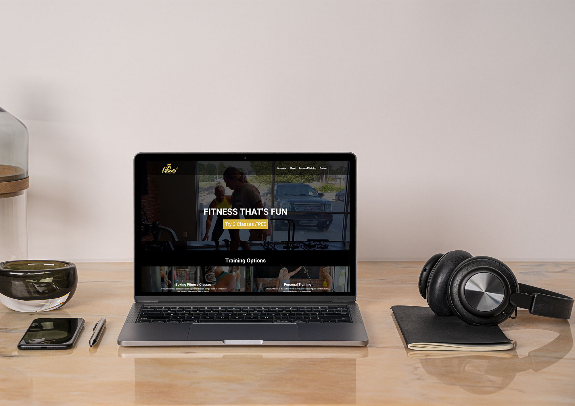
 Let’s take this website, for instance. All of the buttons are the same branded blue, so that you know that if you hover over and click that it’s going to take you somewhere. I even add a nice hover effect to mine that pops up some double right angle arrows, so you KNOW you’re going to get taken somewhere if you click that.
I’ve seen arguments for making some buttons certain colors, eCommerce/purchase buttons another color, but the thing is as long as you stay within your brand colors, it’s contrasting to the background (so it stands out) and they’re consistent, your users will be able to figure them out. Consistency is the key thing here though, because the longer someone spends on your website, the more they’ll learn. Don’t make buttons blue on one page, green on another, and throw a random red in there or they may not know what they’re going to get.
2. Links to Your Social Media Platforms
 This is one of those simple things that I hope you’ll go “Duh!” to, but hear me out. A lot of people do not link to their business’s social media accounts from their website, and that just doesn’t really make sense. After all, if someone wants to work with you, but maybe wants to research you and your expertise, voice, style, even social proof a little more they may want to dig through your social media to find the answers they want.
Make that super simple for them and include links to all of your social media platforms (Facebook, LinkedIn, Instagram, TikTok, Pinterest, YouTube, etc) in the footer of your website. Don’t just throw the links in there, though. Give them a reason to follow you and ensure that you’re using the brands’ icons/logos to let them know exactly what platform they’ll be going to. One of my clients has their links just above their copyright and affiliation logos, giving some direction to keep connected with the business.
After all, a colder lead is much more likely to go and follow and engage with your social if they’re still interested but wanting to learn more about you. Give them that chance and make it easy!
3. Click to Call Phone Number
There was a time when both Android and iPhone would auto-recognize a phone number on a website and convert it automatically to a click-to-call phone number. Unfortunately, for a few reasons, both mobile operating systems have moved away from that and it’s simply best practice to make the phone number a link manually.
What does it mean when a phone number is click to call? Simply put, you’re making that number a link so that anyone on a phone or even a tablet or PC can click that and start a call. With both Android and iOS, it’ll open up your dialer and auto-fill that phone number. All your user has to do is hit the call button and they’re connecting to you immediately. Pretty nice, right?
Making any phone numbers (especially your support numbers) click to call removes a couple of minor but annoying barriers from your clients so again, you’re much more likely to get them to complete that phone call.
4. Physical Location/Address
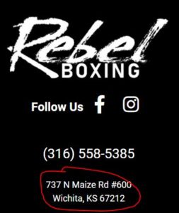 This one is especially important if you’re a local, brick-and-mortar business, but providing your address in your footer can prevent a lot of questions. Typically as a local business people will want to find you and keeping that address in the footer of your website can make it super simple for them to get to you. I even link my clients’ to their Google My Business page so especially those on a mobile device can immediately get directions and start their drive there.
Adding your location, even just a city, state, or country, of where you’re located can also aid Google in geo-targeting the right people for you, but beyond that, it helps potential buyers to know what time zone you’re in. If you’re a huge company this may not be a big deal, but it can be especially helpful for solopreneurs, coaches, and creatives like myself to broadcast where they are so their target audience might know when to expect an email or call back.
5. Sitemap on Your 404 Page
Much like buttons, I should preface this by saying you should have a page on your website just called Sitemap (you can go look at mine linked in my footer) and in that page it should just be links to every single public page on your website.
This helps those who are either confused by your navigation or don’t want to click more than once navigate around, and also helps ensure that nothing gets missed. What’s awesome is when you add this sitemap to your 404 page – the page people see when they try to go to a page that doesn’t exist – they’re given options to find the page they were looking for instead of hitting a dead stop.
I’ve seen a lot of clever and funny 404 pages that make fun of getting to that dead end, but if you don’t want to frustrate a browser and want to get them to the link they were trying to get to, providing that same sitemap on the 404 page keeps them moving and happy.