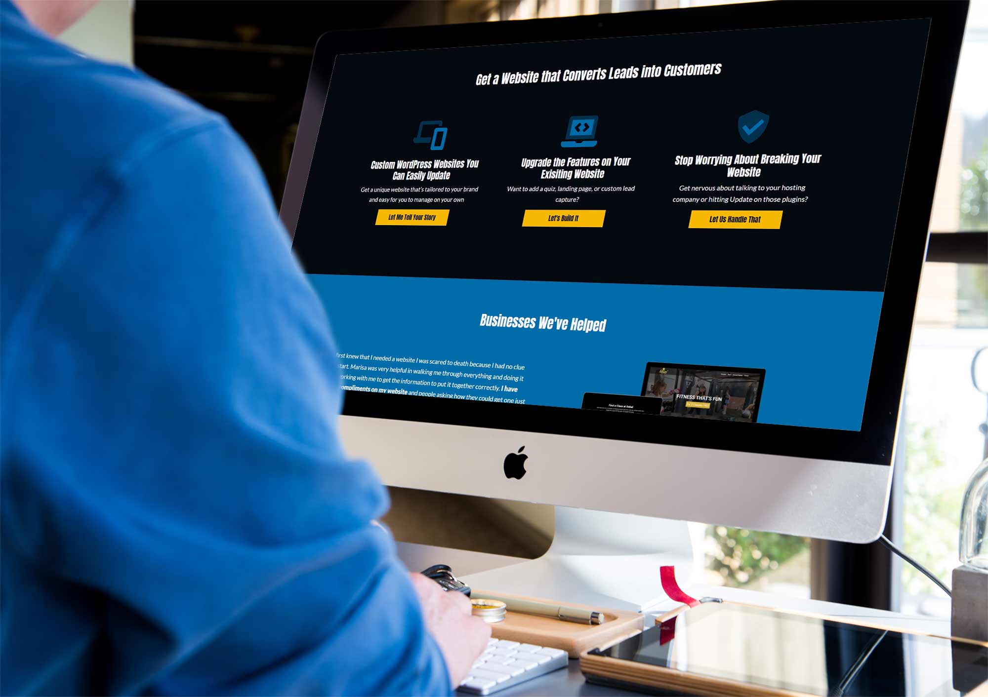
If you haven’t looked around the rest of my website recently, you may not have noticed we just went through a major refresh.
Not a total redesign, but I did add two new pages, portfolio pieces, client testimonials, and change up the design to be a little different than before.
So how did I know that it was time for a website refresh and how do you know when it’s time to start looking to make some bigger changes?
A Refresh Doesn’t Have to Be a Complete Redesign
Before we get too far down this rabbit hole of knowing when the time is right, first understand that just because you need to make some tweaks doesn’t mean you have to change up everything on the website. My page layouts were still very similar to what I had before, especially my pricing sections on my Custom Websites and Website Care Plans pages. I went back through my original copy document (I keep a Google doc separate to my actual website which helps me read the copy without the distraction of how everything looks), and I honestly didn’t change a whole lot. I kept my main purple branding color, but I also decided I wanted to make my blue a bolder one and I wanted to incorporate a yellow into my color scheme. I also changed up my logo and adjusted my fonts, but everything were minor tweaks that if I didn’t tell you, you may not have noticed much of the difference.
In short, just because you make changes doesn’t mean you need to go 100% back to the drawing board and start from scratch. If you already have a website, chances are you’ve got some good things to work with already.
My Business Had Grown and Changed
One of the main things that told me I needed a website refresh? I knew my business had changed a bit from when I started a year ago. To be transparent, I imagined most of my time would be spent building new websites with a few clients I took care of after. What’s actually happened is about 60% of my business is new websites that I then host and manage after launch, the other 40% is built on changes to existing websites (thus the addition of my Custom Code Solutions page and service) and other digital marketing services. I was also working with slightly different clients than I’d imagined or originally set out to work with.
Another thing I knew that I wanted to change? I had a lot of pictures of myself on my website that were outdated. In the time since I’d had those taken (beautiful though they are), my hair had gone from long and purple to short and blue, short and pink, to slightly longer and blonde. I needed to be able to swap those out with what I actually look like now and be easy to change out later when I inevitably change my hair again (it’s my favorite past time!).
How I Approached My Redesign
I knew I was ready to refresh my website when I felt like it no longer aligned with what I was doing on a daily basis and I was sort of embarrassed to send it to prospective clients. After all, it was missing big chunks of information anymore including real social proof.
I built my brand look very quickly last year, so I decided to start there (because you should always re-evaluate or solidify your brand look and voice before you build a new website). Branding to me is far more than a logo – it’s how the company makes someone feel when they interact with it.
Logo & Colors
I started with my logo and colors. I wanted to plan for a longer shelf-life on my logo. What I had was quickly put together in Canva last year just to have something. I took a step back and studied fonts I liked that were softer versions of an 80s bit look (imagine original Pac Man). I wanted to invoke the idea of computers without being overtly nerdy (because let’s be real, I am nerdy enough on my own) and make it softer and more approachable. I also wanted to use a font in my logo that I could use for my headlines and carry that look through my website and other marketing materials. That meant digging through Google Fonts for a great option where I didn’t have to worry about the licensing.
After getting my logo switched up, I wanted to evaluate the colors I was using. In my brand before, I had a purple, blue, black, and white. I wanted to use bold, friendly colors because I’m not your typical WordPress developer and one of the top things my clients say about working with me is how friendly and warm I am. I decided to keep my purple, but chose a bolder blue and added in a rich yellow to the pallet to really brighten up the colors in my marketing. I also ran everything through a color contrast checker to ensure that everything I used would be legible and fully accessible.
Copy
This is where I was pleasantly surprised. Skimming through my website before, I felt like I was going to need to change a lot. But once I started actually reading just the copy (in a Google doc, outside of the design), I discovered that I still loved the copy. I just didn’t like how I’d laid it out. Yes, I needed to tweak a few things throughout and add the new pages and the portfolio highlights in the same brand voice, but I didn’t need to make sweeping changes either. My main homepage headline changed, for instance, but many of the others stayed the same.
This is often true with a full website redesign. Often the copy itself is in pretty good shape; it’s just not always displayed the best way for the message to come across.
Design
This is where the fun really started! Remember, I now had a new logo, new colors, and I wanted to re-lay out some pages to better deliver my message. I also wanted to cut back on pictures of myself and use more of the projects I built.
Personally, I chose cutout images that sit on a solid background. I put more of my clients’ forward and less of myself except where that made sense within the copy. (After all, my prospects still need to get to know me, but they also need to see how I’ve helped others.) I used background images sparingly to increase digital accessibility and started with the mobile design before I even thought about how the desktop would look.
I also chose to change up the blog a bit to make articles a bit more legible and get people to the information they want faster.
Development
Coding the website gave me a good reason to upgrade to the new Bootstrap 5.0 (I don’t like using beta code bases, so I waited until it was out of testing), clean up my code, and write everything a little leaner. I started a completely new WordPress theme and applied some of the things I’ve learned over the last year and applied the new design to my website. I then applied some of those same things to my own starter theme that I use for clients, but made that even cleaner and leaner than what I just did on my website.
When Is the Time Right for You?
In each phase of my website redesign, I fixed and tweaked things to make it better than how I’d built it a year ago. After all, what would be the point to not take a bit more time to really get it right?
It might be time for you to look for a website redesign if you felt like your site fit in with any of the criteria I mentioned above for changing mine. As a reminder, those could be:
- Your services have changed or you’ve added some new ones
- Your audience has changed
- You want to change up your branding
- You don’t feel like your content is connecting
- You need to add social proof
- Your site is slow to load or you have lots of unused pages in your WordPress admin
- Your sales have slipped consistently
- You’re kind of embarrassed to send your website out
There are a lot of other reasons that might be making you feel like it’s time, but the biggest indicator is if you feel like it is. Websites don’t have a standard life cycle per se, but rather should be able to grow and change with your business. You might be able to make minor adjustments or maybe you need a sweeping change.
If you’re not sure what would benefit you the most, let’s chat!


