
Want to learn a new marketing secret? When you follow web accessibility best practices, you’re improving your website’s search engine optimization (SEO) and user experience (UX).
Why? There’s a ton of overlap among those accessibility standards, SEO, and UX. Everything you do to “check the compliance box” and improve your web accessibility makes your website easier to navigate – by real people, bots, and search engines.
Not convinced? Accessible websites can see a 23% increase in organic traffic and rank for 27% more organic keywords. In a time when most websites are seeing traffic decreases due to AI overviews, yours can see real growth instead.
If you’re like me, you love knowing exactly why something works. Let’s break down where SEO, UX, and web accessibility overlap and how you can use WCAG standards to bring more traffic to your website.
Table of Contents
Why SEO and UX Are Important
Before we dig into the meat of this article, let’s make sure we’re all on the same page. Your organization wants to bring people to your website and have that site act as a sort of silent salesperson, right? You need it to help to convert people who are researching you.
How can we make your website effective enough to do that?
We use best practices such as Search Engine Optimization (SEO) to help your website be found by the right people and encourage them to visit it.
Then, we follow User Experience guidelines (UX) to ensure that when people visit your website, they know how to use it and find the answers they need.
In short, SEO helps you be discovered, and UX helps you to convert.
Websites don’t do much when they’re just designed to be pretty. They have to work to bring people in and give them the information they need to make a buying decision.
Understanding the “POUR” of Web Accessibility
Now, how do SEO and UX intersect with web accessibility? For that, we need to understand the guiding principles of accessibility itself.
When we aim to create accessible online experiences (for everyone), we strive to build websites that are perceivable, operable, understandable, and robust. These four principles, also known as the POUR principle, mean that everyone who comes to your website can get all the information they need, no matter how they browse the internet.
Let’s take a quick look at each one of these guiding principles.
Perceivable
When a website is perceivable, everyone who accesses it can understand and interact with all its components. We must ensure that individuals with disabilities or sensory needs can access the main content of your message and use your website. Often, this means you need to provide alternatives to the content you’re creating.
Making a website perceivable improves your SEO because Google and other search engines often crawl your website much like someone using assistive technology would. It also means it’s easier for everyone to use, so it improves your UX.
Operable
For a website to be operable, we have to make it easy for users to get around without hunting, searching, or having the same tools as you. Some users might need to use specialized equipment to interact with the web. Can they interact with your website?
Making a website operable to everyone improves your overall UX as the site is usable for everyone. UX is also a ranking factor with Google, especially, so it can increase your rankings.
Understandable
This one is just like it sounds – can everyone who lands on your website understand it? Not just the content, but how to get around it and the functionality of it should be understandable to everyone. Everyone – no matter their abilities – should be able to get around your website, find the information they want, and understand the content on the pages.
Making a website understandable improves your SEO because you’re often using the right key phrases to attract the right customers. You’re also going to improve your UX, as the site is friendly for everyone who visits.
Robust
The fourth principle combines the previous three and then asks – can it work across multiple devices? Your website needs to be usable by everyone, no matter what device they may be using. That can mean ensuring your website is future-proofed to work when big changes come up, and that it also works with some older technologies.
Making your website robust improves your UX because it’s literally accessible to everyone who wants to use it. It’s also going to help your SEO as mobile friendliness, site speed, and performance are SEO ranking factors with Google.
How Code Impacts Accessibility, SEO, & UX
To create truly accessible websites, you need to code them correctly. Remember, a lot of users who require accessibility accommodations will use different tools and assistive technologies to help them navigate your website. Others will need easy-to-understand “signposts” to get them through your content.
Let’s take a look at some specifics you’ll need to include in your website to improve its accessibility, SEO, and UX.
Fair warning: this is a little developer-centric. I suggest you read through, but you might want to send this section to your website partner to implement.
Semantic HTML
When we write HTML code, we want to use tags that are super specific as to what content is on the page. These tags help assistive tools navigate your website and communicate with your users.
For instance, we need to use tags like <header>, <nav>, <main>, <section>, and <footer> for our page structure instead of generic <div> tags.
Want to know if you have this issue? Go to your website and click View Source (CTRL + U in Google Chrome). If all you can see in that jumble of code are tags and none of the ones I mentioned, assistive tools (and Google) will have a hard time understanding the structure of your website.
Accessibility Impact: Helps screen readers & assistive tools navigate the site (in the correct order!)
SEO Impact: Helps search engine crawlers to understand the priority of content on a page
UX Impact: Disabled users can more easily navigate your website.
Heading Hierarchy (H1-H6)
Have you ever added a new section to a website page or created a blog post? Chances are, you’ve selected the heading size you want to use for your content. That heading size isn’t a decorative choice; it tells your users a lot about how to read your content.
Each page of your website should start with an H1, and you should have only one per page. This is your main thought of the page, and it tells your users and Google what the entire page will be about.
Then, each new section in your page should begin with an H2, with subthoughts introduced by an H3 and on down. Think of it like a college term paper. Your H1 should also be the largest heading on your page, then the H2, and so on.
This visual hierarchy does a lot to communicate your content structure clearly to everyone reading it.
Accessibility Impact: Headings can allow screen reader users to skim the page to the content they actually want. It also helps those with reading disabilities better understand the content.
SEO Impact: Helps Google understand the content and hierarchy of information so it can rank it appropriately.
UX Impact: Users can quickly see keyphrases and content they need. They can also understand which thoughts on the page go together.
ARIA Landmarks and Roles
I’m almost positive that if you’ve had someone work on your website’s accessibility, they’ve implemented ARIA labels throughout. These labels can be shortcuts we add to the code to improve understanding, but should be used sparingly. If your developer uses semantic HTML markup, ARIA labels aren’t needed very often.
When used correctly, ARIA labels provide extra context for complex web elements, such as buttons that have only icons instead of text.
Accessibility Impact: ARIA labels allow assistive tools to understand and communicate important context back to the user.
SEO Impact: Some ARIA labels can provide extra context to search engines. (Again, this is usually solved when using semantic HTML.)
UX Impact: Disabled users can more easily navigate your website.
Keyboard Navigability
Ever tried going through your website without using a mouse? Many people have to use a keyboard or other tools to surf the internet. Can your website be used and navigated (in the correct order) when someone needs to use only the Tab and Enter keys to get around?
Using semantic HTML is a huge boost here. It naturally improves keyboard navigation flow to ensure content is accessed in the correct order.
Accessibility Impact: Everyone can use your website, including those who can’t use a mouse.
SEO Impact: Because your site is easier to navigate, it can reduce your bounce rate and increase your engagement (a clear SEO ranking factor).
UX Impact: Helps all users get around your website.
How Content Impacts Accessibility, SEO, & UX
I get that you may not have much control over your website’s code. After all, not everyone is a coder! So, can you make your website more accessible and SEO- and UX-friendly without needing to learn HTML and everything else? Absolutely.
Much of what knocks a website out of search engine rankings, makes it hard to use, and makes it inaccessible is in the content we upload.
Want to avoid that? Let’s address the common mistakes marketing managers make when uploading website content.
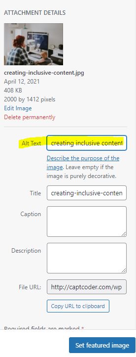
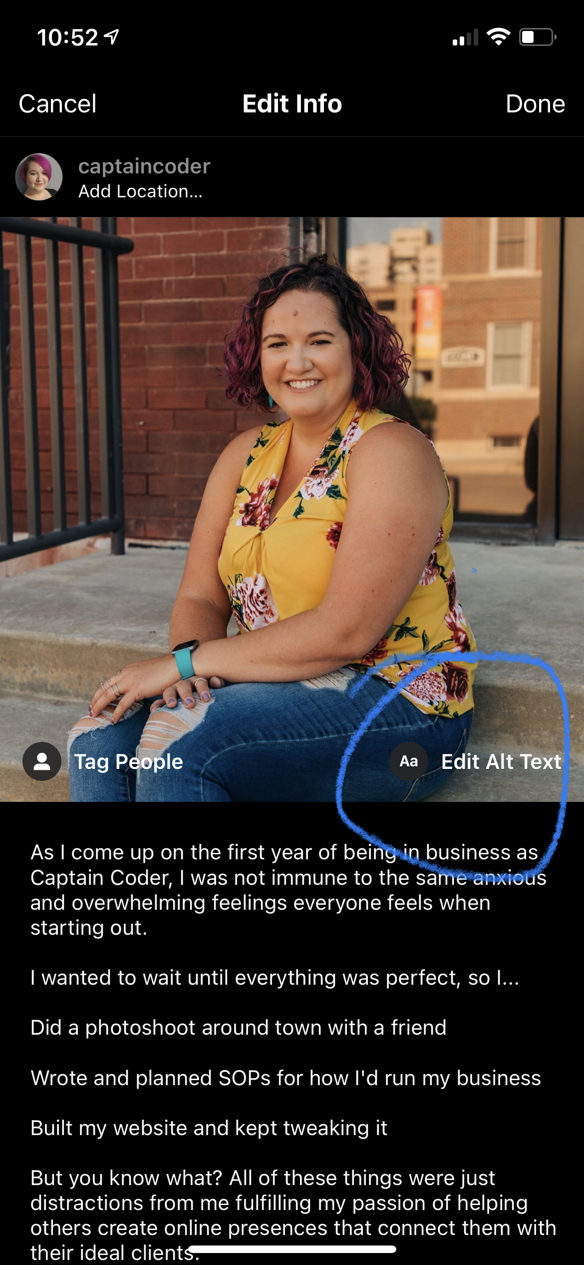
Descriptive ALT Text
Not everyone can see that image you uploaded. How do they get the context? Through the ALT text or alternative text description.
A literal description of the image, this small task helps everyone understand the image’s purpose. This description is added within the image HTML tag so the screen reader knows to read that to its user. Without a description, the image can either be skipped or the image file name read instead.
But don’t worry – you don’t have to write the code. Most content management systems, such as WordPress, allow you to add an ALT description to your images directly in the editor.
Accessibility Impact: Everyone can understand the image’s context and why it’s on the page.
SEO Impact: Google reads your ALT text to understand what’s in your image. This can help not only with regular but also with Google Image Search rankings.
UX Impact: If your website doesn’t load images correctly, users will see the ALT text as a fallback description instead.
Descriptive Link Text
As you’re linking pages and even PDFs in your website, I know there’s a strong inclination to add the words CLICK HERE and hope people click. You might even think that this is the most obvious thing to do, and it’s easy to understand. Unfortunately, this actually makes everything much worse.
Screen reader users and keyboard navigators will skip around the page from link to link. That means they’re hearing or reading “CLICK HERE,” potentially with no idea what will happen when they do actually click.
Instead, we want to link text that tells people exactly what they’ll get when they click. If you’re adding a PDF for the 2026 academic year, for instance, you’d link “2026 Academic Year” in your text.
Even for buttons we want to avoid using meaningless text like “Learn More” and instead use “Discover Our Programs” or “Visit Campus” so they can understand exactly what they’ll get when they click that link.
Accessibility Impact: Screen reader users can tab to a link and know exactly what they’re clicking on before they go.
SEO Impact: Google understands what it’ll find when its crawler follows those links. (It’s actually one of the first steps in how Google determines what a page is about.)
UX Impact: People understand what they’re going to get when they click a link or button and they feel more secure navigating through.
Readability and Plain Language
Listen, I understand the irony of me preaching this while you’re reading a long blog post. BUT, everything we write for the web needs to be easy to skim and be understandable by everyone in your audience.
Scroll up a bit in this post. Notice how I use heading sizes, bolded text, and even design elements to make the content easy to skim through? That’s making your content more readable.
The reality is that the average reading comprehension for US adults sits somewhere around the 5th-6th grade reading level. While your audience might have a higher reading level, no one wants to work that hard to read and understand what you’re saying.
If I have to think about whether or not I want to buy from you, I’m probably not going to.
Instead, we want to avoid our own internal technical jargon and speak as our ideal customers do. We also want to use short sentences and clear formatting to make our content easy to skim through. I hate to break it to you – no one wants to read every word on your website.
You can use free tools like Hemingway to gauge your reading level.
Accessibility Impact: Content is easy for everyone, including those with dyslexia and other impairments, to understand.
SEO Impact: Avoiding jargon means you’re using the language people are actually searching for, which will increase your rankings and click-throughs.
UX Impact: Everyone can skim and find the content that they need.
Providing Multimedia Alternatives
You worked hard on that video or podcast audio, but not everyone can access it. Whenever you use multimedia throughout your website, you need to provide some alternatives to make them accessible.
For videos, you can add closed captions (most players make it easy to add them). For audio-only content like podcasts, you can add plain-text transcripts so they can read instead of listen. (I personally think transcripts are great for videos, as some people have auditory processing issues and like to be able to follow along.)
Transcripts and captions don’t have to take a ton of work to create. You can use tools like Rev or in-app tools in Adobe Premiere or Descript to get them. Just make sure you don’t add your transcripts as a downloadable PDF, because this can create an accessibility barrier.
Accessibility Impact: Users can get the information they need in a way they can understand.
SEO Impact: HTML transcripts provide searchable text for content that bots otherwise can’t “hear.”
UX Impact: Users can get the information in a way they prefer (not everyone wants to listen to a podcast or watch a video).
WordPress Accessibility Best Practices
You’ve got a much clearer understanding of how accessibility, SEO, and UX all intersect and work together to improve the online experience. If you have a WordPress website, how can you ensure you’re following these guidelines?
I understand that you may not be in a place to make sweeping changes to your website right now. But if you’re looking to create a custom, accessible website in the future (or just want to make some improvements now), here’s how you can do that with WordPress.
1. Choose an “Accessibility Ready” Theme
Not all WordPress themes are built the same. If you’re using a premium theme someone else put together for you, do some research to see what you can do to improve its accessibility. A lot of times features are included that don’t get used correctly.
If you’re a fully DIY person and can, you can read reviews to find good, accessibility-friendly themes. Just be forewarned that not all themes are created equal.
2. Use WordPress Features Like the Block Editor
This will depend on how your website was built, but if you’re using the Block Editor (Gutenberg), you can use the Outline tool to view a page’s heading structure.
You can also often change the HTML tag that’s being used for content and switch from a <div> to a <section> for a containing element.
3. Use Accessibility Plugins
Tools like Equalize Digital’s Accessibility Checker will help catch issues before you hit publish on changes. These are real-time audits within the post editor, but this won’t fix your issues. It’ll just tell you what you’re missing and how to fix it on a page.
4. Avoid Overlays
I know it may seem smart to invest in an overlay plugin that “fixes” everything for you. Don’t do it. These accessibility tools can actually cause more issues than they fix, and can negatively impact your UX, SEO, and accessibility in one fell swoop. There’s a reason accessibility overlays actually make your website a lawsuit target rather than help prevent them.
Inclusivity is a Ranking Signal
Let’s be real – I’m aware “inclusivity” feels like a bad word right now. Not only is that utter BS, it’s also absolutely necessary for your website to succeed.
Ensuring that everyone can use your website – easily – is a competitive advantage for your organization. Anything you do to improve your website’s accessibility will help improve your search rankings and the overall user experience.
If you want to keep getting traffic to your website and compete in the next generation of search, it’s time to build it out correctly.


