Modernizing and Improving User Experience
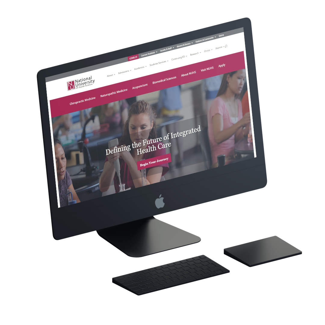
NUHS came to me with a website that had just been converted to WordPress but hadn’t been rewritten, restructured, or redesigned since about 2011. They were not only having to train new staff how to find things on the website (never a good thing), but were wanting to ramp up their online recruiting. With thousands of pages, we began making adjustments in phases, focusing on the highest-priorities sections first.
Results
76%
increase in engaged visits
75%
increase in visits from search
400+
pages reorganized
How We Tackled It
We knew that the sheer size of the website and the reality of an educational institution meant that we would need to tackle this project in stages.
The most difficult-to-understand sections – Academics and Admissions – were our top priority. The pages that would convince a student to enroll were confusing, had many layers, and a lot of duplicate content. That meant when we needed to update something, we had to potentially find 5 or 6 other pages to update the same information.
Using comparative research, analytics, and discussions with long-term university employees, we created a new sitemap that combined and restructured hundreds of pages.
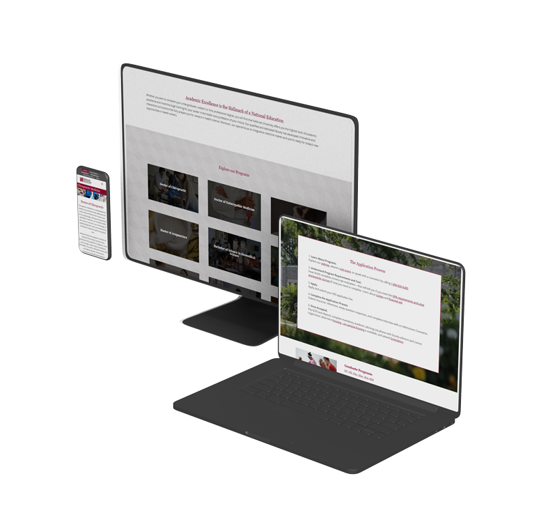
Then, we worked through the content that would be required on each of these pages, making updates where necessary, and providing them with a refreshed design.
We also made sure to improve accessibility and user experience on each page as we worked.
The site is currently undergoing a revamp in other sections and a custom rebuild to allow for better experience across the board.
