
A website will not bring you customers.
You’ve probably heard that a lot from others, but I bet you never thought you’d hear a website developer say it.
It’s true, in that a website in itself will not necessarily bring you customers.
Unless you build a strong foundational website and have a marketing plan attached after the fact to help drive leads and sales.
What do those components look like to build a website that converts once you get people there, though?
Well, luckily for you I made this handy infographic. So let’s take a look at the graphic first, then delve into the details below!
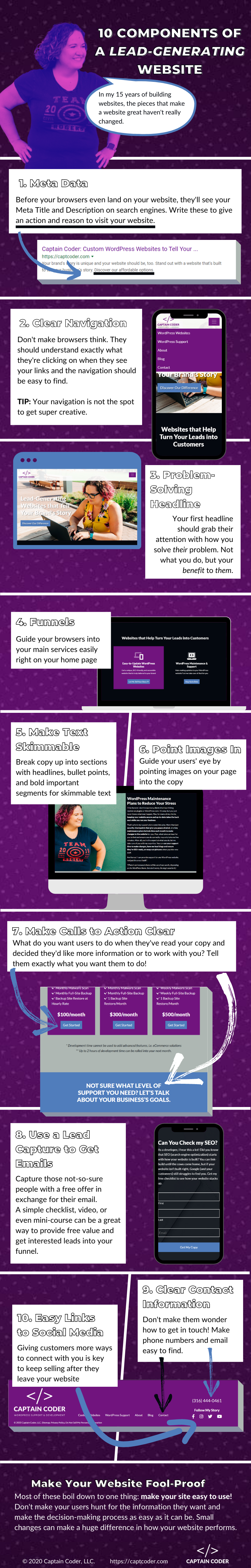
The Components of a Lead-Generating Website
As I state in the infographic, in my 15 (really 20, but let’s not get into that) years of building websites, the key pieces that make a website go from there to great haven’t really changed a whole lot.
While yes, technology and some best practices have and will continue to change, the focus with each of these components is making the journey for the customer as easy as possible from first search impression through their entire experience throughout your website. And after all, that simple strategy doesn’t care what you build the website in.
So let’s dig in!
1. Meta Data
[Image description]: Before your browsers even land on your website, they’ll see your meta title and description on search engines. Write these to give an action and reason to visit your website.
You can see in the infographic where I’ve underlined my own meta description, where I give the searcher a clear action of “discovery”. It’s pretty clear from my description what I do and how I can help my customers. While Google has actually adjusted the view of my meta title a little bit (which they can do, sigh), you can see the idea in the title that I create Custom WordPress Websites to Tell Your Story.
Focus your meta data on the key search factors they’ll be looking for, using some key phrases/keywords to grab their attention, but most importantly, introduce a solution in the description. You have the answers!
2. Clear Navigation
[Image description]: Don’t make browsers think. They should understand exactly what they’re clicking on when they see your links and the navigation should be easy to find. TIP: Your navigation is not the spot to get super creative.
I’ve had to talk many a client off the ledge here, where they want to show their uniqueness in their navigation and the naming of their pages. Look, the navigation is the last place to do that. Your browsers have only just landed on your website and they’re literally going to make a split-second decision in whether or not they’re going to dig deeper and give you more time, or go back to Google and see if someone else has a better answer. Don’t bury navigation links in “creativity” because honestly, they don’t give a shit about your creativity.
3. Problem-Solving Headlines
[Image Description]: Your first headline should grab their attention with how you solve their problem. Not what you do, but your benefit to them.
Many of us, myself included, get really caught up in the features of what we do. We do alllll the things! But honestly, what does your customer care about? They care about how you help them. They have a problem and they want to know you solve it. They don’t even really care how. They just want you to fix it.
A good headline can mean the difference between jumping off your website and scrolling down the page. This doesn’t just apply to your main home page headline either. It applies to all your H1’s throughout your website and most of your sections. Focus on what the customer cares about (and chances are that will include some valuable keywords for you, too).
4. Funnels
[Image description]: Guide your browsers into your main services easily right on the home page.
As I show you in the infographic, if you go to the home page of my website, you’ll see two main options after the first scroll. These are my main services and the things I want to help customers with. You want to make them easy to find because it clearly tells your customer, even further, how you help. Your website may only have one service, so one funnel, but if you have a multi-page website, make your services super clear and easy to delve into further with targeted funnels.
5. Make Text Skimmable
[Image Description]: Break copy up into sections with headlines, bullet points, and bold important segments for skimmable text.
6. Point Images In
[Image Description]: Guide your users’ eye by pointing images on your page into the copy.
Points 5 and 6 really go together, so I’m going to cover them together.
As I mention other places on my website, your copy is much like a college text book – no one is going to read every word.
(Side note: I had a roommate in college who was horrified to hear that we all skimmed our books…and 3 of us were English majors. So I guess the random super-nerd does read every word.)
I digress. “No one” is going to read every word of your website, even if you’re an excellent copywriter. Their eyes will immediately look for the main points they want to pick up, so highlight those! Breaking your text up with simple tricks like sections, shorter paragraphs, bullet points, and even bolded sections will make your text skimmable and get your message across without needing to read every word.
Directing your users’ eyes to the content with your images helps to keep that eye moving the way you want it to. You’ll notice throughout my website and in my images that I try to have the eye-line and body language, even the direction of inanimate objects (and my dog) face in towards the block of text. Don’t direct your users off-screen, but instead towards what you want them to read.
7. Make Calls to Action Clear
[Image Description]: What do you want users to do when they’ve read your copy and decided they’d like more information or to work with you? Tell them exactly what you want them to do!
If, after reading your awesome, skimmable copy, you want your browsers to make a purchase, tell them! If you want them to call you to discuss further (as is the case with more complex, high-ticket items), tell them! As you can see in my graphic, I highlight that on my WordPress Support page that they can either sign up for a plan immediately or talk to me to figure out exactly what they need. Each of those calls to action are in clear, bright blue, and even huge. Can’t really get clearer than that.
The best thing to do is to ensure that buttons are noticeable and you very clearly tell your user exactly what the next step is. Don’t make them guess, whether it’s a simple purchase or a complex sales funnel.
8. Use a Lead Capture to Get Emails
[Image Description]: Capture those not-so-sure people with a free offer in exchange for their email. A simple checklist, video, or even mini-course can be a great way to provide free value and get interested leads into your funnel.
Look, I certainly wasn’t building complex funnels 15 years ago, but as email marketing has risen a simple lead capture on your website is one of the easiest ways to capture people that aren’t quite ready yet, but they’re interested. The lead capture offering should have value, especially to your ideal client. After all, they’re giving you their email in exchange for information and the understanding that you’re probably going to be emailing them later.
In my case, I offer a free on-page SEO checklist. It’s a simple offering, but it attracts those who are maybe looking at their own websites wondering just how well they work. Your offer doesn’t have to be massively intricate. Just focus on giving something valuable.
9. Clear Contact Information
[Image Description]: Don’t make them wonder how to get in touch! Make phone numbers and email easy to find.
Not everyone wants to go through an automated process. Give them a chance to connect with you as a human and get that personalized customer service. I include all the contact information in the footer, where frankly browsers have gotten used to finding it. Every phone number I put on any website I build is also click-to-call, to further remove a barrier for those already using their phones.
If you’re a local business where a location matters, make sure your physical address is also in the footer. I even link my local business clients’ addresses directly to their Google My Business/Google Maps listing. That way the searcher can get directions immediately.
10. Easy Links to Social Media
[Image Description]: Giving customers more way to connect with you is key to keep selling after they leave your website.
This is another one that’s newer than 15 years ago, but it’s a simple one that many people forget. Whatever their goal in connecting with your social media, remove a barrier from your browsers to finding out more about you. So many of us are doing a ton of research into who we work with these days, and social media is imperative to discovering that human behind the brand.
Make Your Website Fool-Proof
[Image Description]: Most of these boil down to one thing: make your site easy to use! Don’t make your users hunt for the information they want make the decision-making process as easy as it can be. Small changes can make a huge difference in how your website performs.
What about you? Have you seen an increase of the performance of your website by implementing any of the above in the past?


