I’ve been building websites before there was WordPress or popular drag-and-drop builders, so when I tell you I’ve seen many web design trends come and go, believe me when I say they’re not all great.
Gen Z and Gen Alpha are obsessed with Y2K (which makes this elder millennial laugh and cringe simultaneously), but it’s not just in clothes. There are things that I haven’t done to websites for 20 years that are coming back as trending.
While web design trends can be a great way to look modern, stand out, and even stay ahead of your competitors, there’s one thing that you need to be concerned about – web accessibility.
Many web design trends that have come and gone over the years have gone because they are not friendly to everyone who wants to use the web.
Concerned about providing a great experience with your website? Let’s break down the web design trends we see this year that hurt your overall web accessibility.
Table of Contents
Kinetic Typography
Who doesn’t like something “fun” that leaves an impression when you visit a website? We often chase something that feels different from the norm, and this year, it’s all about making our headlines stand out.
Don’t get me wrong—headlines are incredibly important for helping your customers understand that you can help them and even move them through your content.
But when you make those headlines move and animate, it can get confusing.
Enter “kinetic typography.”
This moving text is a simple animation technique that you’ve probably seen in videos and movies, and it is starting to appear on websites.
Think of when you come to a website, and a word is crossed out to reveal a different one instead. Or when the text just constantly moves and slides in like you’re literally watching a video.
Do I agree that this can “look” cool?
Sure.
But let’s look at an extreme example from Charlie Le Maignan. The text never stops moving, and the sheer volume of motion on the page gives me a headache.
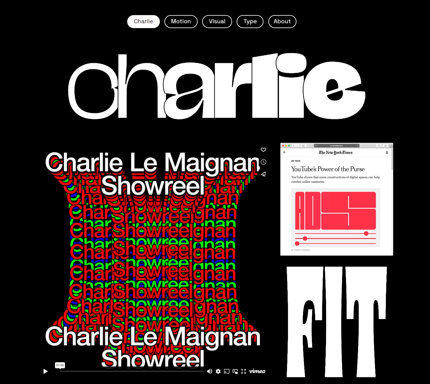
While Charlie is a visual designer who needs to show off his work, it can be difficult for everyone to understand his website.
Who It’s Hurting
Why is this not accessible? For one, individuals with epilepsy need to be able to suppress or pause animations. Any movement on a website that automatically starts, lasts longer than 5 seconds, and is shown with other content is part of WCAG 2.2; they need to be able to pause or stop these animations. Most kinetic typography code libraries haven’t considered that.
Kinetic typography is also terrible for your visually impaired users who require screenreaders when they’re interacting with the internet. I ran a few sample pages through Mac’s screenreader VoiceOver, and the poor thing had no idea what to do when it got to these headlines.
The technical reason? The typography is treated more like an image, and each letter is wrapped in various code tags to allow for the animation. That can make it difficult for a screen reader to decipher that there are actual words on the page.
Does kinetic typography look cool? Absolutely. But you’ll be excluding multiple people in your audience.
Parallax Scrolling
Before diving into this newest recycled trend, let me tell you a story.
When I worked for the Scottish government publisher, our accessibility skills were award-winning. But in 2013/14, parallax scrolling websites were all the rage.
You know, those websites that scroll sideways instead of vertically or animate an entire story as you go down the page?
We knew these websites were probably not the best practice, but they were trending, and we needed to stand out. Years later, I remember laughing with my colleagues about how crazy it was that we did that.
And now it’s back.
Here’s the deal – parallax scrolling can, again, look fantastic. After all, the top layer moves at a different pace than the bottom! How unique!
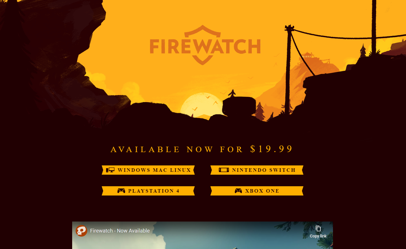
A great example of this is the Firewatch Game. The header is a subtle parallax animation that adds just the right amount of intrigue.
But what happens when you don’t do it right?
Who It’s Hurting
Because the background and foreground move at different speeds, parallax scrolling effects can cause motion sickness for individuals with vestibular disorders or motion sensitivity.
A screen reader might also struggle to navigate a site with intense animations because of how it is coded.
But what troubles me most is that most parallax websites are built to work with the scroll of the mouse. However, in WCAG 2.2, your website must be navigable by keyboard only for individuals using assistive technologies or, like my friend, who have arthritis and find a mouse uncomfortable.
While many parallax animations won’t work correctly without a mouse, your users can still get around your website and be ok. However, we’re seeing more and more that require the click and drag of a mouse, which means you’re excluding users who can’t use one.
Digital Maximalism
Over the last few years, we’ve seen websites go cleaner and more “modern,” as my clients have called the look. And yet, what goes around comes back around, and we’re edging into what can only be called digital maximalism.
Gone are the simple designs. Instead, we want to use complex patterns, gradient backgrounds, and many colors to help make everything on our website “pop” and easy to see. Designers want to create depth and visual interest.
But is it?
This no-holds-barred approach can involve mixing motifs and colors, placing content all over the screen, layering tiny details, and even moving objects.
I’m even seeing this come in the form of Y2K trends that I thought I wouldn’t see again, well, ever (I’m looking at you, Canva, and your weird mouse trailing animation you sometimes use).
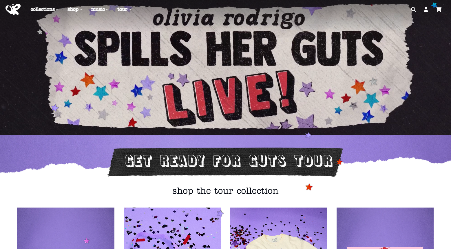
Singer Oliva Rodrigo has a great example of the Y2K aesthetic on her website, where it’s still clean enough but problematic in that many of her effects use straight images to get the look she wants. (And don’t get me started on the annoying star confetti that never stops falling).
Who It’s Hurting
Let’s talk about what makes a good user experience (for everyone, not just those who might use the internet differently from you).
A good user experience (UX) seamlessly guides your users towards their goals (buying from you), making interactions intuitive and enjoyable. It prioritizes user needs, ensuring the website is easy to navigate, visually appealing, and delivers relevant information efficiently.
When you use complex patterns, colors, and animations and go against the “norm,” yes, you can stand out, but you can also prevent people from knowing where to go next and what to do.
The other glaring issue with digital maximalism is that color can be hard on the eye and prevent it from being legible to all users.
WCAG 2.2 requires that most text and images of text have a contrast ratio of at least 4.5:1 to ensure those with visual impairments can still read your text.
It’s hard to justify design when it’s not useable.
Experimental Navigation
You want your customers to be able to navigate your website and get to the other pages. The deeper you can get a user to engage with your website, the higher their engagement and the chances they’ll convert.
You want them to discover your services and what you offer and reach out for more information, right?
I’ll be honest – this next trend baffles me because it does the exact opposite of what we want.
Experimental navigation means that you use a different method than the standard menu bar to give your users a different way of getting through your website.
The issue? Most users don’t spend as much time on the Internet as web designers. So, while we get bored with what’s “done” and want to mix it up, we create experiences that make it harder for our websites to convert.
I’ve seen this over the years with cutesy navigation labels instead of clear ones, “Get to Know Us” vs. “About,” for instance, but experimental navigation is so much worse.
Take a look if you dare at WhatIsMissing.org. Although this organization has a great mission to raise awareness about habitat degradation and loss, its message gets lost on its confusing website.
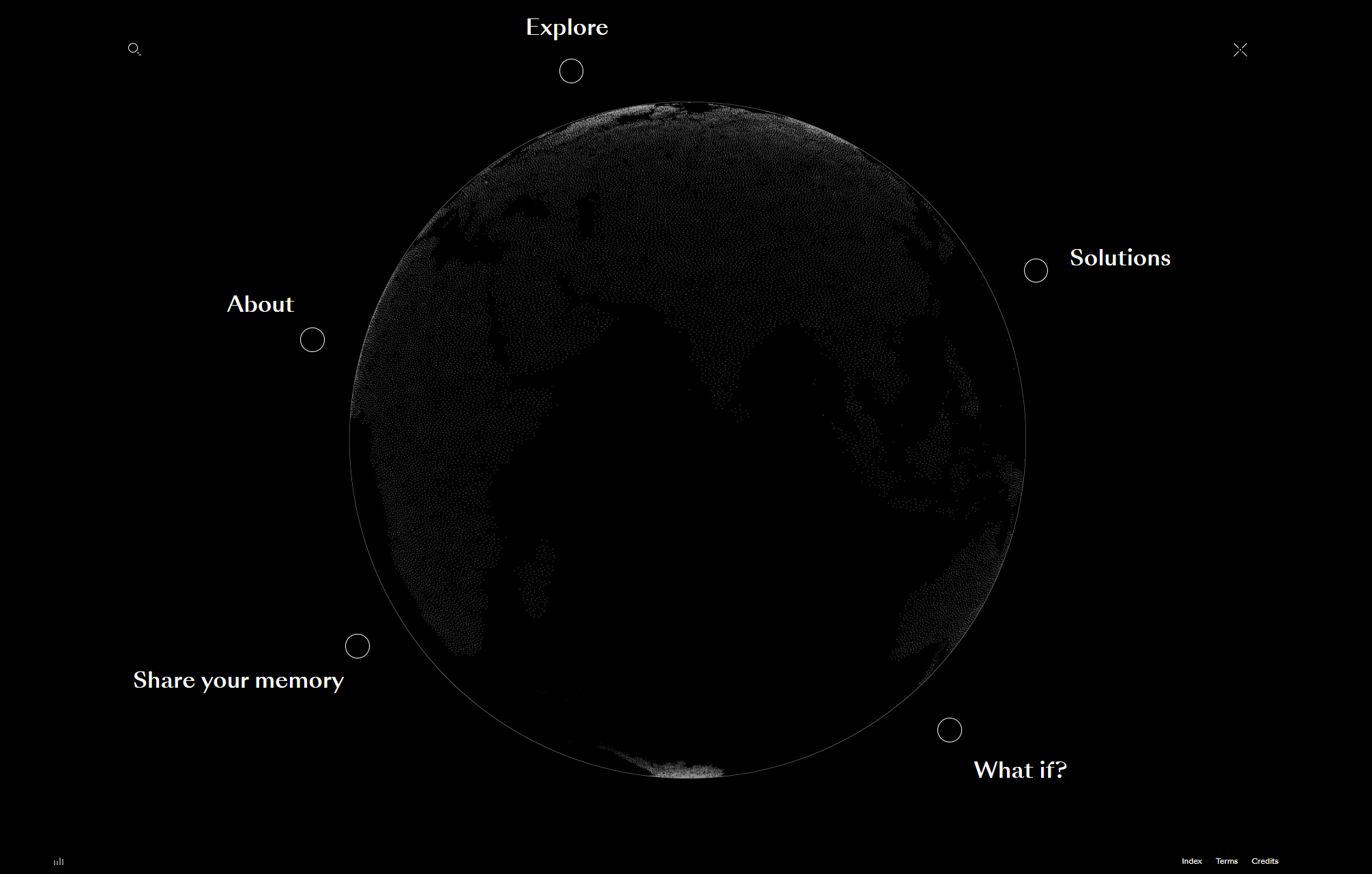
When you finally complete their entry videos, you’re greeted with a globe and six link options circling that globe. Can you use a keyboard to access these menu items? Nope, you’ll just hit the first one and go there automatically.
Who It’s Hurting
Look, I’m going out on a limb here and say this is a confusing experience for literally everyone currently. I understand that design trends will drive some of this forward, but considering I’ve been arguing with clients on the use of a “Home” link and the hamburger drop-down menu for years, I think this is one step we’re just not ready for.
Regarding WCAG issues, experimental navigation is probably not operable only by keyboard (an issue we mentioned before) and is probably not very understandable.
It’s also a good indication that if the site isn’t navigable by a keyboard, it won’t pass usage by a screen reader since it follows those keyboard shortcuts to get around a website.
Interaction/Motion Effects
One trend that can hardly be called a trend anymore because it’s been around for a while is interaction or motion effects.
These are simple animations that activate as you scroll through a website’s pages or hover over a particular piece.
Done well, interaction effects can drive the eye toward a particular part of the page and help readers understand the order of the content.
Unlike many trends we’ve discussed, good motion effects can drive conversions.
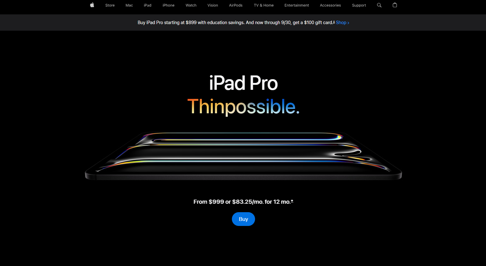
Apple is known for its product pages, which include a lot of interactivity and motion. These pages help you see the important content in one scroll, telling the story of the device and leading you to a decision.
The iPad Pro page is an excellent example of this. Scroll through it and see how the animation helps to present the story.
However, just like with parallax animation, any kind of animation and motion effects can cause issues for a section of your users.
Who It’s Hurting
Any of your users who have motion sensitivities will find animation disorienting. Depending on how the animation is coded, it can also cause issues for screen readers and be difficult to navigate with just a keyboard.
Depending on how your animation is timed, it can also prevent users from having enough time to read what you want them to read. For instance, I’ve seen some sliders that scroll way too fast for even a speed reader to get through.
Animation is tricky to do well, though it is possible. Don’t add it just for fun; make sure it’s strategic and well-tested.
Animated GIFs in Place of Pictures
GIFs are super fun. Am I guilty of this trend at times? Absolutely, in blog articles. But it’s become trendy to use animated GIFs instead of pictures throughout website pages to add some animation and movement.
Videos take up a lot of bandwidth and space and don’t autoplay as nicely. GIFs allow us to have the effect of a video in a 5-second short clip that helps to bring attention to that area of our website.
GIFs run on a continuous loop, so they can be fun to add to an otherwise static layout. They can also help demonstrate your point and provide a simple overview of what you’re teaching.
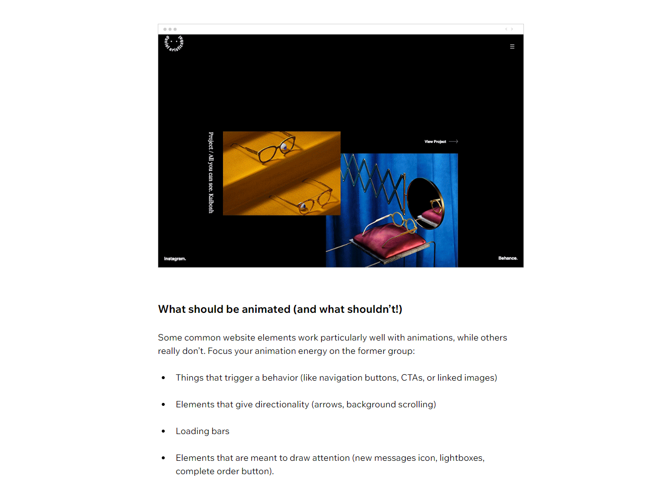
Wix uses GIFs in this way in a blog post on using animation on your website. Their examples are in GIF form, which is a great way to illustrate their points.
But while GIFs might look cool and be a great way to embed instruction without a video, they can also cause many issues.
Who It’s Hurting
Remember how we mentioned that animations need to be pausable or stoppable to comply with WCAG 2.2? GIFs on a continuous loop mean that they animate for more than 5 seconds without much control.
Some GIFs, too, animate too quickly. Fast animations can trigger individuals with epilepsy, which is why we need to avoid content that flashes more than three times in one second.
(I’m seeing a lot of this issue in trending Reel and TikTok templates, too, but that’s another conversation.)
Don’t get me wrong; GIFs can be great, but we must choose them wisely. This is why every single example image on this page is a static image instead of a GIF.
Be Careful with Web Design Trends
Experimenting with something new and different can seem like a lot of fun, but your website isn’t necessarily the place to do that.
When you’re working through a new design – whether with an agency or on your own – I want you to take a step back and answer two questions:
“Will this help me to increase conversions?”
“Will this exclude certain users from my website?”
If the answer is “no” to the first and “yes” to the second, then it’s probably a good idea to drop that trend idea and move on to something simpler.
We all want to stand out, but it’s far more critical that we’re good stewards of the internet instead.
(And as someone prone to migraines, just know that I triggered a headache looking for these bad examples for you. So, point proven?)
Create Accessible Content
Want to know more about creating accessible content? Download my free checklist that walks you through the basics.


