
Can everyone use your website and the content you create, or are you excluding up to 27% of your audience? When you focus on creating content that all people can access, regardless of their abilities, you’re working to improve your web accessibility. On the flip side, when you don’t follow some basic best practices, you’re not just excluding potential customers; you’re putting your business at legal risk.
Just a chilling fact for you – there were thousands of lawsuits filed against website owners last year for accessibility issues.
How can you improve your web accessibility and ensure your content is user-friendly every time (and get that lawsuit target off your back)?
The sad reality is that it’s a pretty simple process to make vast improvements to your website accessibility, and yet it gets neglected far too often.
Let’s break down five steps you should take when creating content for your website.
1. Optimize Images
One of the most common mistakes I see marketing teams make when they update their website is not optimizing images when they add new content. Whether you’re swapping out team photos, adding new projects, or creating blog posts, I see this get neglected all of the time.
Before you upload the next image to your website, follow this quick process.
Use a Clear File Name
WordPress in particular doesn’t allow you to change the names of images after you’ve uploaded them to your website.
Before you upload those images, take a few minutes and rename them to something descriptive.
If it’s a person’s headshot, it’s really easy to just name the file sue-brown.jpg, for example.
At a minimum, you’ll want to use a short description of what’s in the image. Make sure to include dashes between individual words so the screen reader can understand they’re different words.
Why we do this: when an individual is using a screen reader to navigate the web, those file names can get read back to them to give them context for that image. Don’t get caught with an IMG_9383.jpg. It tells your user nothing.
ALT Tag Descriptions
After you’ve named the image, you can upload it to your website. But you’ll want to provide better, more concise description of the image for those using screen readers.
We do this through ALT tags, or Alternative Text tags.
WordPress makes this super easy by giving us a space in the media library when we add an image to write this. An ALT tag should be a literal description of the image to provide context to readers using screen-assistive technology.
For that picture of Sue Brown, your ALT tag can simply be “Sue Brown headshot in front of a white wall.”
While you can use some of your SEO keywords in ALT tags, the primary reason for these descriptions is to provide context, so don’t get away from that.
Never written ALT descriptions before? AHrefs has a handy ALT-text AI tool that can give you good ideas to start with.
Why we do this: when someone is using a screen reader, they can’t see your images. Instead, these ALT descriptions get read to provide context for your user (file names are read as backups when an ALT tag isn’t there).
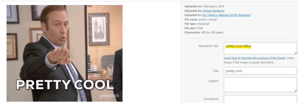
Avoid Text in the Images
Do I break this rule? Yes. But here’s what I mean. Don’t upload pictures that have vital text.
Text within an image cannot be read by those using screen readers, because that text isn’t text. It’s an image.
This also means, btw, that Google can’t read it either. This means that the “headline graphic” you’re using has 0 benefit on your SEO.
If you do upload an image that also happens to have text (like the one I uploaded above), you’ll want to include a very clear ALT description of what’s in that image.
How do we make infographics accessible you may ask? Any large infographic you use should include a detailed description below with important information like statistics, findings, etc.
Why we do this: You want the text on your website to be legible to everyone. The text is what demonstrates that you can help your target audience and have the services they need. When you bury it in an image, you’re preventing a good portion of that audience from understanding how you help (including Google).
Make Content Understandable
This is coming from an English major who loves to write and loves being creative, but all too often we’re creating content that not everyone can understand and connect with.
If you want your copy to be legible to everyone – including those with dyslexia – you need to make it easy to skim and understand.
Use Headlines Correctly
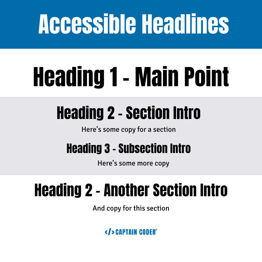
Headlines in your website copy and blog articles can go a long way to improving legibility. They act as signal posts that allow your readers to skim a section relevant to them, understand what they’re going to get underneath that section and orient them.
With headings, you should have one Heading 1 which is your largest headline on the page. This is your most important point on the page.
Then as you move down the page, you use a Heading 2 to introduce a new section or thought and Heading 3’s and up to Heading 6 to break up that content.
You can see that I’ve used headings this way in this blog, but here’s a visual for you showing Heading 1 as the largest heading, followed by Heading 2’s introducing sections:
Why we do this: Headings are a great way to get your audience’s attention and let them know that they’re on the correct website. A heading helps to orient them on the page and let them know what content is important.
Write for Lower-Secondary
Clear and concise communication is key to a great website and selling to your target audience, but for users with dyslexia or other reading difficulties, complex text can be a barrier.
If you want to create content that’s accessible to everyone, you need to write for a lower-secondary level.
This means stripping out technical jargon, using straightforward language, and shorter sentences.
Some ways you can improve your content is to use more of your customer’s lingo, use bulleted content, short sentences, and bold important passages to make copy easy to skim.
If you’re not sure whether you’re within this threshold, you can use tools like Wordcounter.net and Grammarly to check your content.
Why we do this: When you make your content easy to read and understand, you’re reaching everyone regardless of their abilities. This inclusive approach fosters a positive user experience for everyone and empowers all visitors to engage with the content.
Link Relevant Content
We all want people to dig through our website and find the information they need, but are we making it easy for them to do so?
You need to include some links throughout your website, and no your menu is not enough.
If you have a place in your content that makes sense, you’ll want to include a link to another page on your website.
For example, if I talk about web design, I can make “web design” a link to my web design page. (Which if you go back and look, I just did that.) These links allow your audience to navigate easily through your website, but its especially important that you make the text that is a link something relevant to the destination page, not just throw a “Learn More” in there and link that.
This is incredibly important for those using screen readers in particular.
Why we do this: These links act as signposts, providing clear and relevant ways to jump to different pages of your website. This allows users with visual impairments or cognitive differences to explore the content at their own pace and find the information they want easily.
Check Color Contrasts
Before you create any graphics or update your website, you need to ensure everyone can read the text you’re adding. When you use a low-contrast font color on top of a background color, someone who has low vision or color blindness might not be able to read it.
We want everyone to be able to read our content, right? While you’re working on an update, run your colors through an accessibility tool first like WebAim’s free contrast checker.
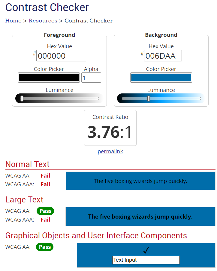
If it comes back as a fail, or even mostly a fail, that means not everyone will be able to distinguish the text.
Before you ever go into Canva and create a graphic for social media, check the hexcodes of the font color you plan to use on the background color you plan to use and make sure it’s legible.
Why we do this: Color blindness can make colors that are too close together blend. Remember those visual puzzles we did as a kid, trying to see if you could read the text within the patterns, but it only worked if you crossed your eyes? Imagine that, but that’s your life. Make it easy to read your content, not a puzzle.
Avoid Text on Images or Patterns
Another quick way to make your content illegible? Putting it on top of a busy picture or background.
You might love that pattern, but it can hurt the eyes and prevent people from being able to read it.
That picture might be a gorgeous location shot, but the various colors in it can make it hard to get a high enough contrast for the text to be legible.
You can use outlines on your text, a plain-color box underneath, or some other design tricks to make this all legible. But the key here is to avoid it when you can.
Why we do this: Images and patterns can introduce a lot of visual variation, making it difficult to ensure a strong contrast between the text and the background. But this isn’t just for those with visual issues. Patterns and pictures can be overwhelming for those with cognitive disabilities, too.
Optimize Audio & Video Content
Do you have a podcast or create YouTube videos? Put any of those on your website? You need to include alternative options so anyone can access that content.
Captions allow not only those with hearing impairments to be able to access your content but can help those with cognitive issues process what they’re watching.
And let’s be real, most people are watching videos without the sound anyway.
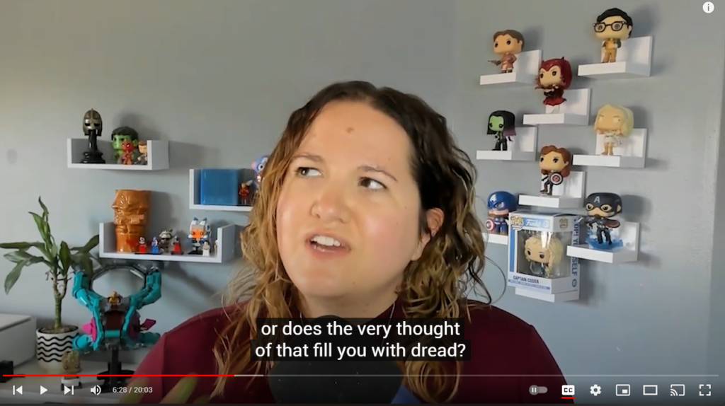
Create Closed Captions
If you’re creating videos with any kind of narration, you need to include captions so that everybody can access the information in that video.
Thankfully, this has become quite popular, so many platforms have automatic captions already built in. Instagram and TikTok offer you several options for captioning, you can use apps like Caption to make them more stylized, and YouTube adds captions automatically (though not always immediately after the video is loaded).
For longer-form videos, you can use a service like Rev.com to create captions that you can upload to YouTube or Vimeo. This is especially useful when you’re creating videos for lead magnets, online courses, or a welcome video for your website.
Why we do this: You worked hard on those videos. Make sure everyone can follow along by using captions. This is so easy now it’s not even an excuse at this point. Offer captioning for any video with narration so you can reach everyone.
Offer Transcripts
If you have just audio on your website, you’ll want to ensure that you have a transcription option available, too.
Audio doesn’t necessarily have captioning in the same way that video does, but some individuals don’t want to listen; they just want to be able to read and get the same information.
My blogs are a basic transcription of many of my podcast episodes, for instance. This allows me to reach everyone and they can get value from my podcast even if they can’t (or don’t want to) listen to it.
You can include transcripts as a downloadable txt file (NOT a PDF), or in an expanding box they can open, too, if you want to have them right there on your website.
(Do I think audio-only Clubhouse died as a social media app because they weren’t accessible? Absolutely.)
Why we do this: Your audio content is great, but not everyone can listen to it. Help those with hearing and again, even cognitive disabilities to be able to get the value out of your content with a transcript. They can either read along with the transcript or just read the transcript by itself.
Ensure PDFs Are Accessible
Web accessibility public enemy #1 in my opinion? PDFs.
So many businesses use a simple PDF as a lead magnet, not understanding that there are people in their audience who can’t read that PDF at all.
Which just leaves you with frustrated people who are never going to buy from you.
Let’s take a few minutes and make your PDF more accessible. You can use an auto-tool like Pave, but that won’t be perfect. I recommend you splurge for Adobe Acrobat and take a few minutes to use its accessibility tools.
Check Color Contrast
While you’re creating that PDF, I want you to ensure that you’re keeping an eye on color contrast.
Often we want these freebie PDF downloads to be well-designed and print allows us to get a bit creative.
But that doesn’t mean we ignore color contrast. Make sure you’re using the right color combinations as you identified before and everything is legible.
Why we do this: Your audience downloading that PDF still needs to be able to read it. Following color contrast best practices means that your content is accessible to everyone – no matter how you serve it. But especially with PDFs.
Make Text Searchable
Creating your PDFs in Canva or somewhere else first? Don’t select the “flatten PDF” option. This turns your PDF into one big image and that my friend, can’t be accessed by any sort of assistive technology.
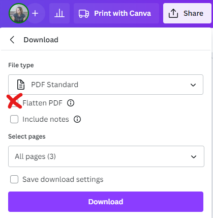
If you’re creating in Canva, download the full PDF and check that you can copy and paste text directly out of the PDF.
With the pro tools, you can now Prepare for accessibility and it will help you set reading order, and set options for screen readers, screen magnifiers, and more.
Why we do this: A PDF can be like a little e-book, but not a lot of the proper tags and work is built in yet, especially when you’re using design tools to create a document of content. Make sure that everyone can read your PDF by spending a few minutes running through this process.
Use ALT Descriptions
Remember how we created ALT descriptions for images on our websites?
We can do that with PDFs, too!
Using Adobe’s accessibility tools, you can go through and add descriptions to every image within your PDF.
Follow the same best practices you do when you’re adding ALT descriptions to your website images.
Why we do this: PDFs can be read to visually impaired users with a screen reader, too. Help them understand the context of your images with ALT text.
Web Accessibility is a Process
Creating accessible content doesn’t just start and stop with your website when it’s built.
Every single update you make to that website needs to follow a process to ensure that every piece of content you’re adding to your website continues to be accessible.
I can build an accessible website that can become inaccessible because a client doesn’t follow this process when they’re updating their content.
Make this part of your content process every single time. I want to set you up for success so I have a freebie just for you.
Grab my Creating Accessible Content guide and you’ll get a full checklist and links to resources to help you keep your content accessible – every time you post something new.