Over the last few months, I’ve been buried in a couple of large website refreshes for two clients. Both had very different needs and reasons to want to refine their look and improve their overall website, but they both understood that it was long past time to take a better look at their website presence.
How do you know when the time is right for you to rebuild or even refresh your website?
Of course, just by reading this article today you may already feel like it’s time. After all, you clicked the link and decided to read it!
Refreshing your website doesn’t have to be a huge overhaul either. It can literally be a bit of a “spring cleaning” that you take in stages to make it more manageable (and a better fit for your budget).
I’m going to take you behind the scenes of these two website refresh projects and tell you exactly why we decided to make the switch, how we got to that conclusion, and even what steps we took to refresh (because both were very different).
A Few Website Questions to Ask Yourself First
Before we dive into my two projects, I first want you to stop and ask yourself some questions.
Are you experiencing any of these symptoms when someone asks for your website?
- Nerves and anxiety at what they’ll think
- Remembering that thing you meant to update but never did
- Embarrassment
- Wondering if they’ll understand you can help them, even though your website was written for a different audience (you no longer serve)
- Hesitance to tell them the URL
- Wanting to tell them just to go to your Instagram instead
If any of these sound like you experience when someone asks for your website, it might be time to make some changes.
But just because you need some updates doesn’t mean you have to throw the whole website out the window.
Refine Your Website’s Actual Objectives
A website is your home online; the place that anyone who’s interested in working with you will eventually go to to learn more about your business and how you might be able to help them.
You have to know what you want people to get out of your website when they visit it to ensure that it’s doing its job. Your website isn’t just your home online. It’s an investment and should be generating some kind of return on that investment.
With both of these projects, we sat down and asked: what’s changed since we built the website? How are sales doing? Are leads constantly confused? Is anything missing?
Websites are digital, which means they can and should be changed as the company grows and changes. It should be an accurate reflection of what you do for your clients and customers.
With both of these projects, the websites weren’t as misaligned as they were just not totally accurate to the current state of the organization.
And I know, I know, you’re beyond ready to dive into the behind the scenes so let’s go!
Website Project #1 – A University Refresh
When I first started working with National University of Health Sciences back in 2021, there was a lot with the website that I wanted to fix.
This website is massive. At the time, it was over 700 pages, with hundreds of news articles, faculty pages, classified ads, and so much more.
As my time with them went on, I started to take note of the potential UX issues that I saw. But what we also saw was new Admissions team members had a hard time navigating through the website. And if our own staff couldn’t understand it without a training session, how were we expecting prospective students to navigate the website to find answers before they enrolled?
Step One: Take Stock of the Page Inventory
A website this massive requires a lot of analyzing. We looked at analytics, talked with staff members, and looked at a lot of competitors’ websites to see how they organized their very similar information.
This particular structure was created in 2010-2011, back when SEO required a lot more content and we just had a different experience with websites.
What we did know is that we wanted to overhaul the structure of the website as a whole. There was a lot of program information under the Admissions section (something we couldn’t find on any of our competitors’ websites), and not enough program information under the Academics.
The biggest problem? The website was full of hundreds of pages of basically duplicate information. This made updating content a nightmare from my team’s perspective, but it also made it hard for the staff to keep an eye on inaccurate information.
Step Two: Map Out a New Structure
So what did we do?
We got to work creating an entirely new structure for these main two sections of the website.
This required a lot of looking at analytics, deciding what we might be able to combine and what we might need to keep. It meant a lot of time working with the Admissions department to ensure all of the information we had was accurate and the flow made sense.
It also just meant literally mapping out a couple dozen pages and planning 301 redirects for the literal hundreds of pages we were planning on deleting.
(I’ll be honest – I didn’t let Nicole delete those pages because I wanted the personal satisfaction when we got there!)
Step Three: Create and Edit Copy for the New Structure
Now that we had a completely different flow of the website, we needed to go in and coordinate the copy that went with the new pages.
We didn’t rewrite much during this process, largely because we plan to do that in another phase. For this project, we were able to reuse and repurpose a lot of the copy we already had, and just put it in the new structure.
There was still a ton of back and forth on this, making sure everything we were communicating was still accurate and made sense with the flow of the programs. We were also lucky that we were able to work with a lot of that copy because there were still a hundred pages or so that were being kept in this section of the website.
Step Four: Refresh the Design
The old website had some, well, pretty boring pages.
When you hit the informational pages, it was basically just a wall of text with a sidebar to take you to other pages that were just walls of text.
Fun fact: no one is going to read every word on your website. In fact, most of us just skim. We knew that we needed to present this information in a way that was far more scannable, so we refreshed the design on all of these pages.
We added visual break ups, small infographics, and short tables and bulleted lists to keep people moving. I also included a lot more headlines to break up the text into shorter sections and make it easier to read and move through.
Step Five: Test, Test, and Test Again
We knew that we weren’t going to be able to work through the entire website. After all, just two sections was hundreds of pages and hours upon hours of work.
So instead, we focused on keeping a reasonable flow between the updated pages and the old ones and then we did a lot of testing.
We had to ensure that everything still linked together where it should, that it all made sense, and that even our faculty and staff were happy with the updates.
Probably the best part of the entire process for me?
Getting to read how excited the Admissions counselors were for the much easier experience they had and how much easier it was going to make their jobs.
A Work in Progress
We’re actually in the process of working on a migration (we’re bringing a lot of content into the website that used to be housed on Hubspot, long story), and planning out Phase 2 where we get to fix more of the website.
You’re not likely going to have a site this size – in fact, I hope for your sake that you don’t – but the same principles would apply.
We didn’t have to build from scratch whatsoever and we were able to use a lot that we already had in place. We just had to give it a better structure and a little bit of polish.
Website Project #2 – The Course Creation Expert
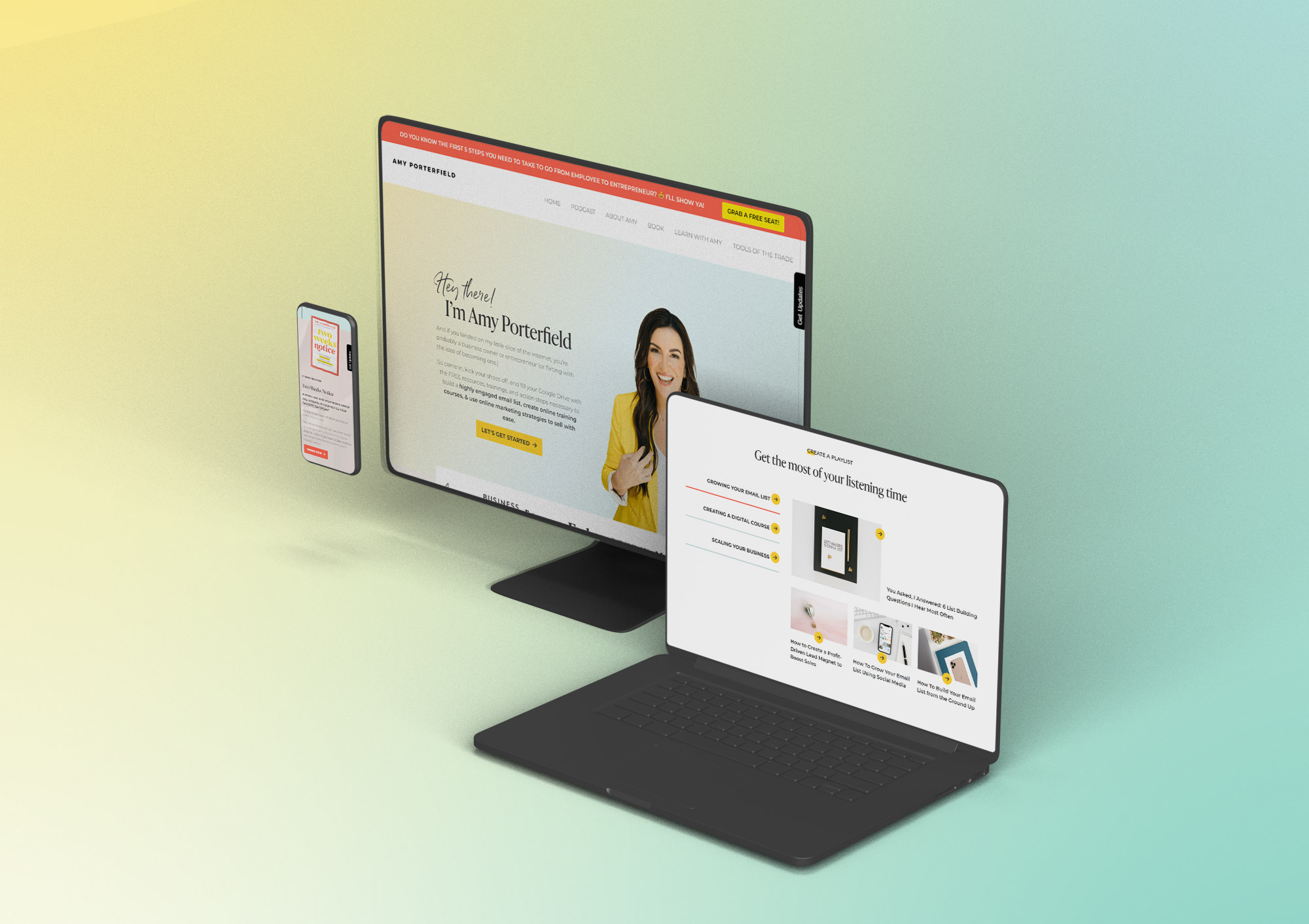
One of my favorite new clients of 2022 was getting to work with Amy Porterfield. I’ve followed her for years, so getting to help her team launch Digital Course Academy and their other endeavors?
Amazing!
But I have a critical eye, and I noticed that her main website pages could use a little love.
Amy’s website is a bit unique in that she has a distinct brand for her main courses. The bulk of her website revolves around these courses, but the main pages you start on (her home, About, Podcast, Resources, and Course directory), hadn’t been updated for awhile.
Her team came to me in the fall and mentioned that some updates were coming up, but they hadn’t decided yet what that would look like. But with a book launching today! (February 21, 2023), they knew they wanted a refresh.
We had a kick-off call back in December to go through the finer points, then their designer Erica got to work.
While the Captain Coder team was only in charge of development, there was still an entire process that went into this.
Step One: A Bit of Restructuring
We were keeping the main pages of the website, but some of what was on those pages was going to change.
For instance, on the homepage they wanted to add a promo section for Amy’s new book Two Weeks Notice, as well as highlight her super popular podcast in a slightly different way.
The About page went from being a lot of text sections to having a fun new timeline that told Amy’s story of entrepreneurship in a quick, scannable way.
And the podcast page added a few new features to help sort through her 500+ podcast episodes plus of course a callout for her new book.
And all of the pages got a new, fun footer and an Instagram feed.
Step Two: Refreshing the Brand
Part of the desire to get a website refresh done was to refresh Amy’s brand. They wanted a look that matched the book branding a bit better, and they wanted to inject some of these new colors they were using in other areas.
Erica designed a beautiful brand guide for us to use and then from that, created new page designs using the content and structure they had decided on from the beginning.
Step Three: Building it Out
I won’t go into the minutiae of how Amy’s code is structured, but she does run a WordPress website.
I knew that a few of the sections would be updated on a more regular basis, so I made sure to make doing those updates super easy. I wanted her team to be able to get in there, change language, swap out pictures, and add new things without having to contact me every time.
The most important thing to me was that they could use a section from one page on another page if they wanted to, so I created a completely flexible layout that allows them to choose from pre-styled blocks they can use and customize over and over again.
I also wanted the site to load quickly, even though we were adding new graphics and video, and to be more accessible. I not only did what I could to lean out the code, I made sure to follow accessibility best practices to increase Amy’s reach.
Just a Refresh
The biggest lesson I want you to take from Amy’s site? It was just a website refresh. Yes, we built and designed new pages, but it wasn’t every single page on her website. We worked within the existing structure of her site and were able to build this all in a much smaller time frame because we just focused on those things that mattered most.
The site has literally been live for just a few days, but I had so much fun working through the logic of what we were doing and how we could improve things without tearing it all apart.
You Might Not Always Need a New Website
You’ll often find that website agencies tell you that you just need to start from scratch.
While yes, there is a time and a place for that (and hey, I love when I’m able to recode something from the ground-up), there might be a lot that you can improve with just some tweaks and a bit of a face-lift.
Your website needs to match your business and reflect its current form. The great thing about websites is that they are easy to change and it’s never a permanent thing. In fact, I can bet money that we’ll be doing more tweaks on both of these projects over the coming months and years.
Are you ready to get more sales, a better user experience, and a return on your investment with your website? Let’s make it better and turn it into the lead-generating machine it can be.
Just get on my calendar and let’s talk through it!