
Picking out the colors you want to use in your business can be an incredibly personal experience. You’re choosing how you want people to see your business, how they feel when they come to your website or view your social media, and you’re expressing something about your unique business.
Choosing colors, however, can’t just be about what you think looks good.
Did you know that the colors you choose can actually exclude customers from interacting with your business?
One of the easiest ways to make your digital presence more accessible is to be mindful of the colors you’re using – especially on your website.
Given that 1 in 4 adults live with some kind of disability, you have to be mindful that your website and everything you create online can be used by everyone.
And yes, that means even the colors you choose to use in your business.
Color and Web Accessibility
Unfortunately, not all colors are fully visible to those with color blindness.
Think about this for just a moment. Depending on the colors you choose for your website, you might be creating a website that someone can’t even read.
That’s pretty much the opposite of what you want, right?
Web accessibility covers a variety of topics, but one of the first decisions you can make in your business that allows you to be more accessible is color.
Before you settle on your brand colors – and especially any color combinations you want to use – you want to check Web Content Accessibility Guidelines (WCAG) to ensure you’re following recommendations for accessibility.
Color Contrast
Ok yes, I know this is getting a bit technical. What do you need to know as a business owner who uses Canva to create a lot of your content?
You need to pay attention to color contrast.
This is basically the contrast that your font color has against the background color you’re using.
When you’re following WCAG guidelines for color contrast, you’re ensuring that someone who is color blind or visually impaired can still read your content.
What happens when the contrast isn’t high enough?
All that copy you wrote might not be legible at all.
Meaning you’ve excluded a potential customer from working with you.
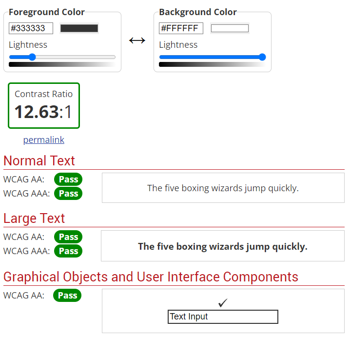
This is a pretty solvable problem too, since it’s easy to check your colors with WebAim’s free Contrast Checker tool.
Dos and Don’ts with Web Accessibility and Color
When it comes to using color, especially on your website, it’s not all about contrast (although that’s an important one).
Here are 5 Dos and Don’ts you’ll want to follow when creating content for your website, social media, emails, ads, basically anything.
Don’t Let “Design” Get in the way of accessibility
This one is going to hurt the most, but you should never choose how something looks over whether or not it’s accessible.
There are ways to design beautiful content that is still accessible (and of course, this comes with some caveats). But the key here is you don’t want to choose to do something wildly inaccessible just because it looks “nicer.”
You’d be surprised how often I argue this case with designers I work with.
Always be sure you’re focusing on providing a good, legible experience with all the content you’re creating.
If it’s pretty but not accessible, well, you might be cutting out a huge portion of your target market so you’re not going to reach a lot of people anyway.
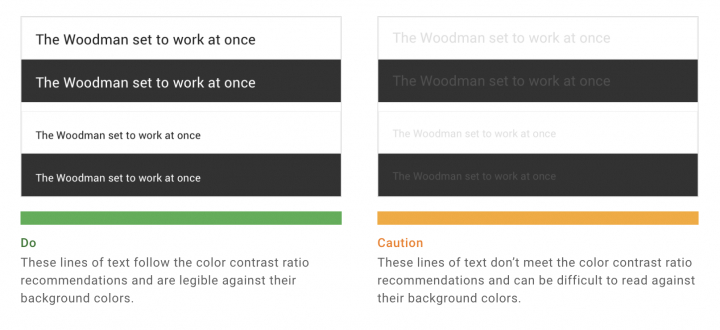
Don’t Use Low Contrast Text
This falls in with our discussion on color contrast, but you always want to avoid low-contrast text. When the color that your words are written in does not stand out enough, you can cause eye strain on even those with the best vision.
Low contrast can also just be impossible to read. Personally, I have astigmatism and -3.25 vision in both of my eyes. While I wear contacts to correct my vision, I still can’t read a lot of what I see especially on Instagram.
This example from Google’s Material Design is a great visual so you can see how low-contrast text affects legibility:
Don’t Rely on Color Alone to Give Important Information
This is a trap that a lot of designers fall into, especially with websites, but you can’t use color alone to provide important information to your user.
Think about links. When you have a link somewhere in your text, you don’t want it to just be indicated by a different color. That color difference might not be perceivable to everyone and they’ll miss that there’s a link there.
Instead, add something else to show that there’s an important thing to pay attention to. In the case of links, you can use underlines, bolded text, and change things on hover to make it really clear.
On my own website, I have my links not only appear in my branded blue color, but they’re also bold so they stand out.
Do Make Interactive Things Stand Out
When you want someone to click or do something, you need to make it super clear that they can.
Think of the buttons on your website. Those need to stand out and be super easy to see.
I often do this by making buttons look like, well, buttons. You want to use a contrasting background color and make it a box so it’s really easy to know that’s something you can click on.
The colors you choose for your buttons should follow color contrast best practices so that your users can read them and understand what they’re clicking on.
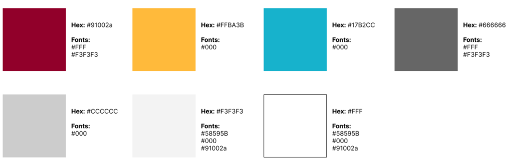
Do Test Your Color Combinations First and Keep a Reference Guide
One of the best things I can recommend to you is to create a reference guide for yourself. You probably have already selected your brand colors, but it takes just a few minutes to load up the WebAim Contrast Checker and see which of your colors can be used as font colors on what backgrounds.
Instead of trying to remember this off-hand, create a simple guide (I just set mine up as a free Figma board) that you can reference whenever you need.
Then use this guide any time you create content – whether on your website, for social media, or ads – so that no matter what you’re putting out into the world, it’s accessible and legible.
How Important is Color and Accessibility
OK, at this point, you might be thinking this all sounds like a lot of work.
And you’re right. It definitely takes some time upfront to ensure that you’re creating accessible content, even with your colors.
While it should be enough to know that you’re providing a good experience for all of your potential customers, it’s also about following the law.
Here in the US, ADA standards apply to not just physical locations but to your websites as well.
And who has to follow those standards?
Any business that is “open to the public.”
That means yours, my friend.
So while it can take you more time, and might require some expert help, to get your color combinations accessible, it prevents you from not only losing out on potential customers but also protects your business from violating the law.
Or getting sued.
If you want to protect your business, let us take a look. Our website audits look for and highlight issues like color contrast and provide you with solutions to make your entire website more accessible.


