
When you have to do a ton of different things throughout your day, you need to work smarter, not harder. That’s one reason tools like Canva have exploded over the last few years. Social media managers can quickly create graphics for posts, marketing coordinators can whip up a flyer, and graphic designers can make this super easy for everyone by creating branded templates. But are those easy graphics actually making it more difficult for your customers to understand your content?
Tools like Canva and AI are just that: tools. You still need to follow design best practices to produce great quality graphics.
If you’ve been using Canva, especially the templates available in their library, to create graphics for your marketing campaigns, you could be excluding some of your audience from them.
Let’s talk about the best practices you need to follow to get great, accessible graphics from Canva and other design tools.
Table of Contents
Testing Brand Colors
If you are using Canva Pro and some of its more advanced features, it’s likely that your brand kit is set up with your colors. Have you ever tested which of your brand colors can go together?
When you create a graphic and choose one of your colors for the background, your font color has to have a 4.5:1 contrast. If the contrast between the two colors is not high enough, the text may not be legible to everyone. A classic example of a good color contrast is black text on a white background, but of course, you want to have more fun with your designs than that.
And you can’t trust that the color combinations in the free templates throughout Canva have been tested. If you are using some of these templates and veering away from strict brand colors, you will want to test those colors as well.
How to Do It
To ensure that your color contrast is high enough, you can use free tools like WebAim’s Contrast Checker. All you have to do is add your chosen font and background colors’ hexcodes (a 6-digit alphanumeric code that Canva will show you). The tester will tell you if it passes or fails.
If the contrast ratio is above 4.5:1 and Normal and Large text AA say they pass, your colors are good to go!
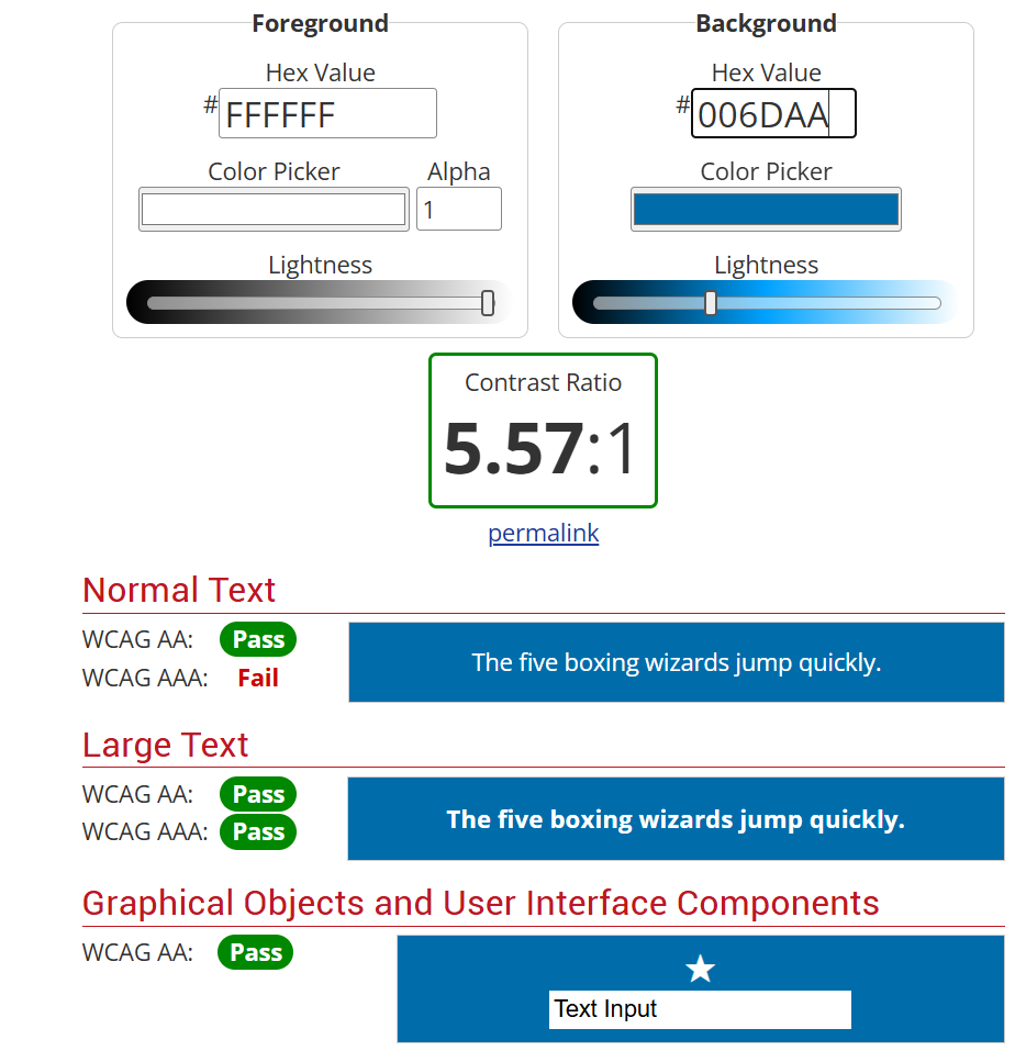
If your colors do not pass, you need to select and test other combinations from your brand.
Who This Helps
Individuals who have low vision or color blindness cannot read text when the contrast is too low. My color blind friends say that, depending on how bad it is, they can sometimes see the text, but they don’t want to work to read your marketing content. If the color contrast is egregiously low, they may not see that there’s text there at all.
But let’s be real – this helps everyone, especially if you are using bright colors.
Selecting Fonts & Sizes
One of the great features of Canva Pro is that you can add your custom brand fonts to your kit. If, however, you have not done that, or if you are using fonts from Canva’s library, make sure you select readable ones.
How to Do This
While sans-serif fonts can be readable, a serif font is typically a safe bet. You also want to avoid fancy-looking script fonts for more than a couple of words. The way their lines go together can make it difficult to read.
For font weight, stick within the medium range. Too light and thin, the text can be difficult to read. Too heavy, and you can have the same issue.
Depending on the type of graphics you are creating, ensure your fonts are at least 16px. Honestly, for social media content in particular, I recommend making this larger so it helps to stop the scroll.
Who This Helps
Individuals with low vision can have difficulty with fonts, especially on screen. This can include older people with age-related vision loss and people like me who are nearly blind without their glasses.
Adding ALT Text to Images
Canva is a great tool for presentations, and certainly something I prefer using over Microsoft Powerpoint. I have a lot of clients who use it for creating quick PDF resources, too (more on that in a bit). While I discuss ALT text on websites a lot, you can also add it to your assets in Canva.
How To Do It
Within your Canva design, select the image you want to add a description to. Click the 3 dots or more, then select Alternative Text. All you have to do is write the description in the box and click Save when you are done. Canva has a walkthrough video of how to add it.
The great thing is that this ALT text gets added into your files even when you export them. Currently, this works for PDFs, presentations, HTML, and design share links.
Who This Helps
People who are blind, visually impaired, or have cognitive disabilities use assistive tools like screen readers to navigate the internet. The ALT text allows the tool to read the image’s description back to them so they know exactly what is in your presentation or PDF.
Creating PDF Resources
Let me be blunt: PDFs are not the most accessible content. If you can avoid using them, do. However, sometimes they are the easiest way to provide freebies, packets, or large amounts of information as a downloadable resource. If you are creating PDFs in Canva, however, there are a couple of crucial steps you need to take to ensure you are not just downloading a single large image instead.
How To Do It
As you are creating your PDF design, it’s important that you add ALT text to the images you add. You also want to ensure that you are testing your color combinations and fonts and sizes are accessible. But one of the most important steps actually comes when you are downloading the design from Canva.
For digital resources, it is OK to choose the standard PDF, but do NOT select the Compress PDF or Flatten PDF options. This will strip out the vital elements of the PDF that make it readable to assistive tools.
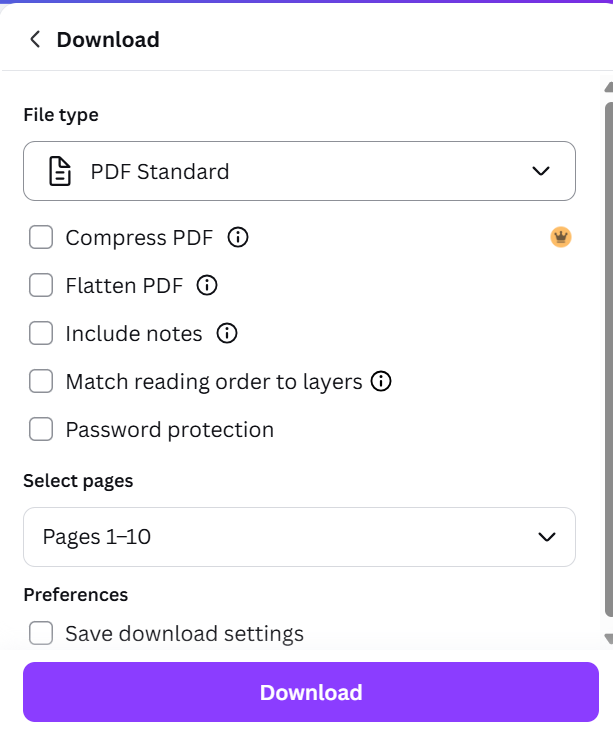
I would also run any PDF through Adobe Acrobat’s accessibility checker to ensure it is usable by everyone.
Who This Helps
Much like your other downloadable assets, following this process allows anyone who needs to use assistive technology to get the full benefit of your PDF.
Choosing Safe Video Templates
Not everyone is a video editor, and sometimes when you are creating quick social media assets, it’s all too easy to use Canva or even CapCut templates. But the transitions in these videos are often problematic and too fast. I have seen some beautiful ideas, from companies as large as Marvel, that could create physical reactions in people scrolling social media.
How To Do This
If you are using a video template, make sure there are no more than 3 flashes in a single second. You can time this, but many trendy designs I see all over social media have rapid transitions that flash very quickly.
You want to choose templates with slower transitions or with a few seconds between most of them.
Who This Helps
Fast flashes and transitions can trigger seizures in people with photosensitive epilepsy. Keep in mind that social media autoplays your videos, so this can quickly be problematic for some of your customers.
Setting Up Accessible Brand Templates
Perhaps the best thing about Canva for any marketing team is how rapidly you can create great social media assets. One of its most powerful tools is the ability to create brand templates. This means your graphic designer can go set up a few design options, and your social media team can create beautiful graphics on their own.
If you want to ensure that your team is following brand standards and accessibility guidelines, have your graphic designer test your fonts, color combinations, and select safe video transitions. Then, they can create several types of graphics, slide decks, or video templates within your Brand Kit.
To ensure that ALT text gets added and PDFs are downloaded correctly, create a checklist for your team to follow every time they work within Canva.
Accessibility Reaches Every Customer
There’s not a lot of point in spending time creating beautiful marketing assets that exclude up to 27% of your customers. Following some basic accessibility best practices and using the tools built into Canva actually helps you reach everyone.
Want to get a process in place that your team can follow every single time? Download my Creating Accessible Content checklist. It includes all the steps and resources you need to ensure your marketing reaches everyone.