
You run an agency. I know that your to-do list is long and you’re managing a lot. Between client expectations, deadlines, and your team, learning one more thing can feel pretty overwhelming. And I’ve talked to enough of you to know that “ADA Compliance” is something that you just don’t feel you have space to deal with.
Enter AI. It can help make so many different things in our business easier, right? Why can’t it help me with website accessibility? After all, you can pay a few bucks a month for a one-click checker to help you find the problems. Or better, sell an overlay to your clients that you can make a bit of profit on as well. This shields your clients from lawsuits and fixes a bunch of code with just a bit of JavaScript, right?
Wrong.
There is a very expensive gap between what passes in an automated web accessibility scan and being truly accessible.
Website accessibility isn’t an overlay; it’s the foundation of how your website was written, designed, and coded. Automated checkers are great at catching the easy stuff, but they’ll miss a lot and can even make things worse for your customers’ users.
In this post, we’re going to delve into what these ADA compliance checkers consistently miss, and why relying on them might create a bigger liability for your agency than doing nothing at all. If you want to offer your clients true website accessibility when you deliver a project, it’s time to move beyond AI and see how a website is actually experienced by a human being.
Table of Contents
Code Issues ADA Compliance Checkers (Like accessiBe) Misses
Don’t get me wrong. I love a good automated web accessibility checker to help me quickly find issues. This is the first step in testing any website for WCAG compliance. But what a lot of these automated compliance checkers don’t tell you is that you’re only finding about 30% of those issues with their scanners.
Most scanners get the “quick-fix” things like missing alt text, color contrast issues, and skipped heading levels. But they don’t see the issues that can cause problems for actual humans using assistive technology to go through your websites.
So what are they missing? Let’s dig into the basic code issues that compliance checkers like accessiBe just won’t catch.
Meaningful Semantic HTML vs a Bunch of Divs
I haven’t found an automated scanner that flags that your website was coded without semantic HTML. And yet, this is an important issue when it comes not only to web accessibility but also to SEO.
Most WordPress page builders and other platforms are notorious for wrapping everything in a <div>. While that technically “works,” it communicates nothing to Google and assistive technologies about the content.
Your entire page should be coded and structured with the correct HTML tags to ensure that someone can navigate through it correctly. When everything is in a <div> element (especially when you introduce flex-box in your CSS and start re-ordering things artificially), screen readers can read your content out of order. No one wants that.
Semantic HTML tells assistive tools exactly what to expect in that area of the page AND it brings some automatic features into the overall user experience.
Per W3C’s semantic HTML example, when you use the <button> tag instead of a <div>, it has better styling by default, is identified as a button, and is focusable and clickable.
Using Semantic HTML to Structure Your Webpages
If you’ve been using page builders to create websites, or it’s just been a minute since you’ve written the HTML, the tag you choose matters. Most page builders now allow you to select the HTML tags of the elements you’re creating.
Here’s how a page should be structured:
<nav>Navigation goes here</nav>
<header>H1 and intro goes here, NOT the navigation bar</header>
<main>
<section>H2 and new thoughts go here</section>
<section>H2 and new thoughts go here</section>
</main>
<footer>Footer goes in here</footer>
There are semantic HTML elements for more than just the page structure, too. A few you can and should be using are:
- Articles – <article></article>
- Headings – <h1> down to <h6> (In order!)
- Paragraph – <p> (not <div>)
- Forms – <form>
- Table – <table>
- Quotes/Testimonials – <blockquote>
- Buttons – <button>
Logical Reading Order
We touched on this a bit already, but how you code your website will affect the order in which they’re read. Screen readers will go through a website and follow the HTML order. If you use flexbox and columns, especially, this can cause issues.
What do I mean? Let’s look at this example from a recent audit. Visually, the hours look correct. The day is next to the hour, and everything lines up:
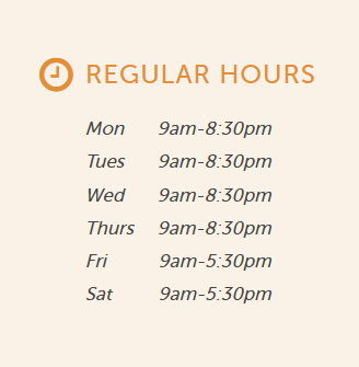
However, as I tested, the screen reader read all of the days first, so “Mon, Tues, Wed, Thurs, Fri, Sat” then read the hours. As a blind user, that’s frustrating because I now have to try to remember where I’m at to know the hours, especially since they are different on Friday and Saturday.
When you open up Inspect, it’s super easy to see what happened. The code was written so that the two columns were combined into a single row, rather than a row for each day.
<div class="row">
<div class="col-xs-3">
<div>Mon</div>
<div>Tues</div>
<div>Wed</div>
<div>Thurs</div>
<div>Fri</div>
<div>Sat</div>
</div>
<div class="col-xs-9">
<div>9am-8:30pm</div>
<div>9am-8:30pm</div>
<div>9am-8:30pm</div>
<div>9am-8:30pm</div>
<div>9am-5:30pm</div>
<div>9am-5:30pm</div>
</div>
</div>
The way a screen reader works, it absolutely is going to read the days first, then the times, because that’s how they appear in the code.
To make this accessible, it should be:
<div class="row">
<div class="col-xs-3">Monday</div>
<div class="col-xs-9">9am - 8:30pm</div>
</div>
<div class="row">
<div class="col-xs-3">Tuesday</div>
<div class="col-xs-9">9am - 8:30pm</div>
</div>
<div class="row">
<div class="col-xs-3">Wednesday</div>
<div class="col-xs-9">9am - 8:30pm</div>
</div>
<div class="row">
<div class="col-xs-3">Thursday</div>
<div class="col-xs-9">9am - 8:30pm</div>
</div>
<div class="row">
<div class="col-xs-3">Friday</div>
<div class="col-xs-9">9am - 5:30pm</div>
</div>
<div class="row">
<div class="col-xs-3">Saturday</div>
<div class="col-xs-9">9am - 5:30pm</div>
</div>
Simple fixes like this make a huge difference in how someone experiences your website, but an automated compliance checker will never find that.
Font Sizes and Headings
While I love using an automated scanner like WebAim’s WAVE, it also won’t find issues with your font sizes and headings. For your website to be readable to most, the smallest font size you should use is 16px. While this depends on your typeface, anything smaller than 16px can be hard for many people to read.
There are a few things that go into your text to ensure it’s readable and understandable. Let’s break this down a bit further.
Avoid Pixel Sizes
When you’re setting up a stylesheet and bringing over the designer’s vision, it can be easy to just grab the H1 font size that’s 50px.
However, we never want to use pixels to define a font size. Visually-impaired people need the ability to increase the font size on the page. When they do this, all fonts need to scale with it; otherwise, your body font could be set to 25px while your H1 is still at 50px.
Instead, we want to use either ems or rems when setting font sizes. While ems respect the base font size you’ve set in the body, rems will respond to the browser default (16px).
For our example H1 headline size, we’d set that to 3.125em instead of 50px. That makes the H1 3.125 times the size of the base body font size. So if we had a body font size of 18px instead, we’d set it to 2.78em.
To find the ems you just divide your designed font size by your body font size:
Heading font size / body font size = em unit
Use Headings Correctly
Skipped heading levels absolutely get flagged in good automated scanners. However, they don’t know if you’ve designed them wrong.
I often get a request to “add some emphasis” to an H2 and make it appear larger than an H1. “Just in that one spot!” they lie.
Why don’t we do that? The code is still an <h2> so a screen reader sees it right!
Visual significance is an important part of overall accessibility and user experience. If your H1 is 50px (so 3.125em) but your H2 is 60px (3.75em), it looks much more important than your H1. Your heading 1 should be the most important headline on the page. Styling an H2 element as larger reduces the user’s perceived significance.
This causes confusion for people as they skim down the page and try to find what’s most important to them. Your headings should follow a descending size from H1 to H6.
The Human Things AI Can’t Find
For a long time, marketing agencies have cared far too much about the bots crawling their customers’ websites and not the humans using them. Yes, we want them to appear in Google search results and possibly in AI. But are Google or Chat making the purchases in the end?
Yeah, no. (Well, not yet.)
There are many things we put into websites that affect humans, and most ADA compliance scanners just don’t understand them.
Let’s run through (a bit quicker this time) some of the human gaps that AI just can’t find.
Contextual ALT Text
Can my compliance checker see that the image of a dog has an ALT text description? Absolutely! Does it know that that description should probably be “Our CEO’s dog Buddy, a happy golden retriever” instead of just “Golden retriever”? No, it doesn’t.
ALT text is there to provide context to your users. It’s not there to add a bunch of keywords or to just exist so you pass a scan. It takes more time, but when adding pictures, you need to consider why the picture is on the page and what context a blind user should have.
Vague Anchor Text
One of the reasons I love WebAim’s WAVE tool is that it will absolutely flag anchor text like “Click Here” and “Read More” as suspicious. But it can’t get all of the links with missing context.
When we add links to a website, users can use the keyboard to navigate from link to link. Someone using a screen reader may not listen to the entire webpage, but instead choose to go from link to link.
Why is this a problem? Because if we just get “click here,” “learn more,” or “read this,” we have no context of what we’re actually clicking.
Instead, we want to add some context to our anchor tags. Links should include something about the page they’re going to. For example, you’d have “Read more about our services” linked instead.
Are you linking a button? If there’s actual written context around it – say, an article where the H3 is the title – then you can use “Read More” with a twist. Add some context in a screen-reader-only tag. This way it’s invisible to most, but it provides context to those using assistive tools.
<a href=”/destination/>Read More <span class=”sr-only”>about Article Title</span></a>Menu Traps
One of the first things I test for? Does the main navigation have dropdowns, and do those open on hover or click? I’ve had this debate with other agency owners who think hover is what people expect, but in reality, it causes a ton of issues.
When a menu dropdown opens only on hover, this can cause an issue for users who use something other than a mouse. Hover menus, when not coded correctly, can become traps where users have to tab through every single link to exit the menu. If this is a large menu, that’s just a frustrating experience.
Hover menus cause issues for others, too. When a menu opens only on hover, users with less control over their mouse movement may have the menu close when their mouse moves off a small section of the screen. We’ve all had frustrating experiences trying to navigate websites with small dropdowns, and you have to be in just the right spot to keep it open. Individuals with motor control issues can become incredibly frustrated.
A good rule of thumb? Your menus should open with a click instead, but make sure to add a dropdown arrow to indicate there’s more information. This also means that the top link isn’t a link to a page; it opens the menu instead. The first link should be in the dropdown menu.
Design & Interactive Issues
When was the last time you tested a website you’d built like you were a customer making a purchase? Have you ever tabbed through it? Or asked a friend if they could figure it out without you guiding them?
There’s a lot that we build into websites that we think look cool, but can cause problems once we actually attempt to use them.
Websites are built to be interactive. We want them to help guide people all the way to making that purchase, filling out a form, or picking up the phone. But did you know that many accessibility issues can prevent people from making those choices?
Keyboard Traps
We love using date tools in forms or adding a pop-up to get a quick sign-up. But can people get out of these without using a mouse? It’s important to not just test the regular front-facing things, but the interactive elements you’ve added.
One client of mine had a carousel you couldn’t escape from using the keyboard. Imagine getting stuck there with a screen reader and just hearing the same content over and over and over again.
Hover and Focus States
Most of the automatic ADA compliance checkers look at the static colors on your website, but have you checked the other states? If you hover over a link or a button, is that still legible? Color contrast matters in these alternate states, too.
You also want to ensure that you’ve added focus or hover states to interactive elements so it’s incredibly clear that this is something you can click on and do something with.
Design Inconsistencies Cause Confusion
Perhaps the thing I argue with designers about most? Your website design needs to be incredibly consistent throughout.
You don’t want to have orange buttons in some places, green in others, and red on another page. If your H1 is 50px on the homepage, it needs to be 50px throughout the rest of the website. If your header looks one way on an inside page, it should look like that on every other page.
Design consistency is a huge part of user experience design, but it’s also a key factor in website accessibility. When your website has too many unique design pieces, it can confuse users with cognitive disabilities, and that’s something no bot can judge.
And just a bonus tip. When your design has too many elements crammed into one space and isn’t organized to guide the user, it can be incredibly difficult for someone with ADHD to focus on what you want them to. (I say this as my own tester on that front.)
Your Business’s Risk: Compliance vs. Accessibility
I get that you want to protect your clients and potentially make more money, too. But achieving legal compliance (usually WCAG 2.1 AA) can’t be done with an overlay or an automated testing tool.
Last year, accessiBe was fined $1 million for false advertising. This led web accessibility lawyers to target sites using their overlay tools, putting businesses at even greater risk. Even if you’re just using their automated checkers, you won’t protect clients from real accessibility issues.
Beyond that, your agency’s reputation is at risk. If your client gets a demand letter despite paying you to help with “compliance,” well, are they going to be your client anymore?
Even more stressful? More and more web accessibility laws are being enacted.
If you’re not helping your clients with websites that are built correctly, you’re doing them a disservice.
White Label Web Accessibility Solutions Are Your Secret Weapon
You shouldn’t have to be an expert in WCAG and the ADA to offer those services. There’s a lot of conflicting information online, so I get that you don’t want to dig into all of it either. But I promise, there’s a better way than letting AI (attempt) to help you.
Instead, use a human to provide website accessibility solutions for your clients and actually protect them.
Captain Coder’s white-label website accessibility solutions include manual audits, accessibility remediation, custom development, and even consulting. With a web accessibility partner, you can expand your offers and launch accessible websites – without hiring teams of new developers or spending months studying WCAG.
Want to know what it’s like having us as your web accessibility sidekick? Let’s schedule a call and put those ADA fears to rest.


