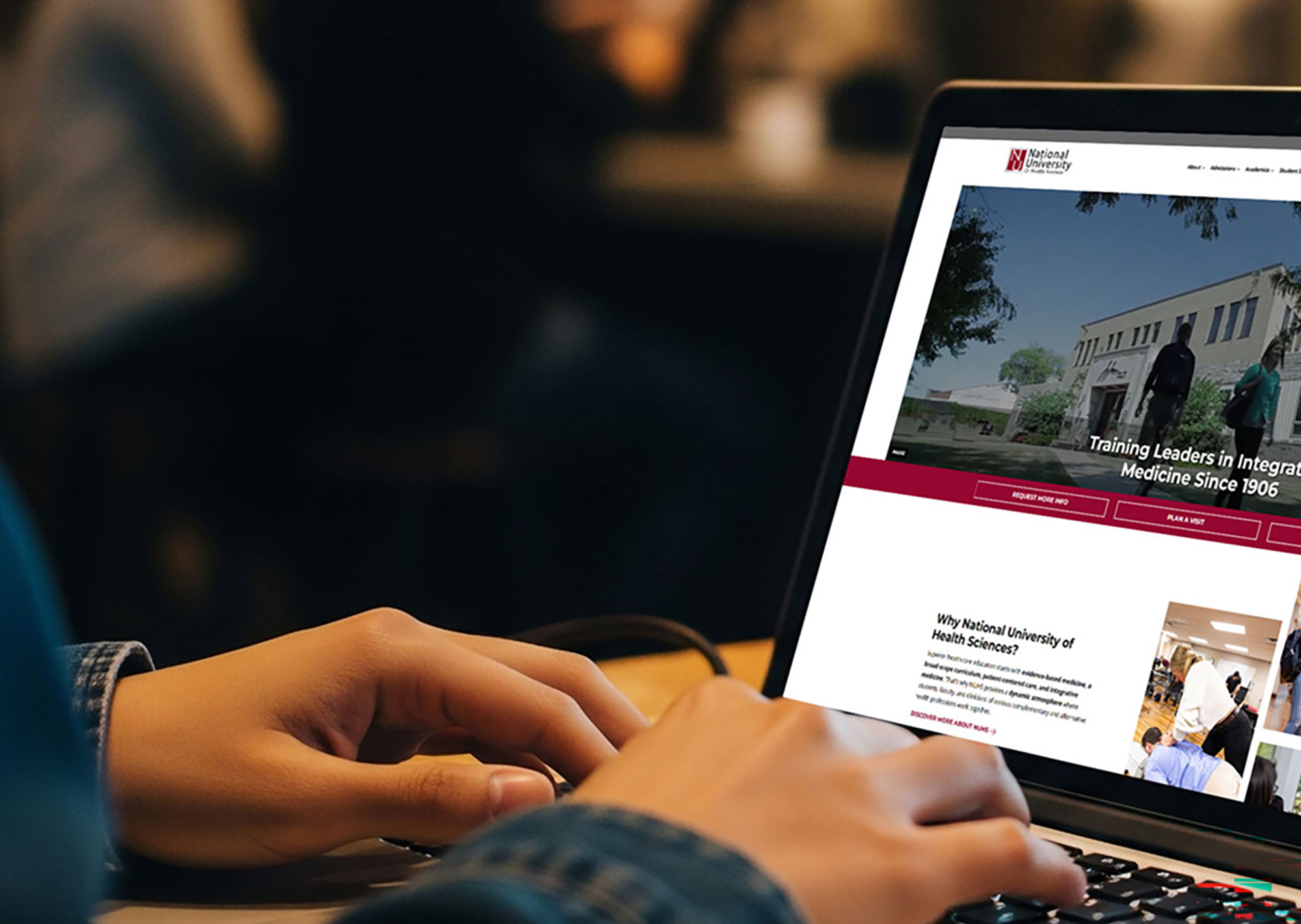
You’ve spent a lot of time pouring over your website, ensuring you’ll get the right visitors who will convert – but have you missed a vital piece? There’s a pretty high chance that your website isn’t accessible to visually-impaired people.
Once, I had a client tell me that they didn’t “have to care” about accessibility because they weren’t trying to recruit blind customers. Before you get as angry as I was, their point was that they thought web accessibility only helps a small percentage of people. After all, even the CDC says only 3% of under-18s and 1 million US adults have blindness. But visual impairment also includes individuals with low vision and even color blindness.
It’s more than just those directly affected, too. When we add the friends and family affected by their loved one’s vision loss, their spending power adds up to about $13 trillion. This much spending power, and yet only 4% of the internet is accessible.
Whether you’re trying to improve your own conversions or you’re building websites for others, this is a huge leak in any funnel. It’s also a legal liability and a missed opportunity to showcase your full value to clients.
Making a website accessible for the blind and visually impaired isn’t a “compromise” in the design you want, either. It’s about building the website correctly from the beginning and creating something that not only looks good, but also functions for everyone.
In this guide, we’re going beyond why we should create accessible websites to discuss how we can improve the experience for people with visual impairments.
Table of Contents
How the Visually Impaired Experience the Web
Have you ever tried using a screen reader tool? This is actually how I got my start in web accessibility and why it matters to me personally so much.
Back in 2013, I started my new job for the Scottish Government publisher. I was coming in to help as a front-end and PHP developer. While I built websites and custom solutions, we also spent a lot of time converting PDFs into fully-accessible HTML. Before I was ever allowed to touch a line of code, I was asked to turn on my Mac’s VoiceOver feature and try to surf the internet with my eyes closed.
Oh dear god, was that an eye-opening experience.
Thirteen years ago, less than 2% of the internet was accessible (sidebar to lament we’ve only improved 2% in 13 years). You can imagine what that was like. I couldn’t even navigate my favorite websites at the time, let alone get around.
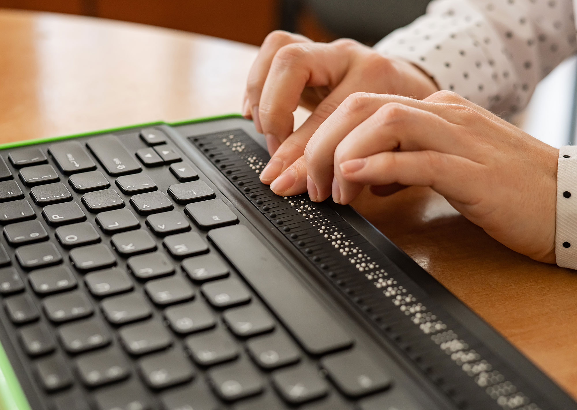
Many people who are blind or visually impaired use assistive technology such as VoiceOver, JAWS, NVDA, or Braille displays to help them navigate the internet. They will often navigate your website using the keyboard rather than a mouse, too. And of course, these individuals aren’t visually scanning your website either. But much of the internet isn’t coded correctly for these tools to work as people need.
If a website is broken for a screen reader user, one of two things happens. Either they hit the back button and try another option, or they have to ask a friend or family member to help them navigate.
Neither of those is what we want to have happen with our websites, yes?
Here’s the absolutely crazy thing. It doesn’t take much time to improve websites for the visually impaired. In fact, a ton of the things we’re going to dive into actually follow SEO and UX best practices, too. Let’s dig into how we create a better internet.
Offering Visual Clarity and Low Vision Fixes
Let’s talk first about how we help those with low vision or even color blindness. You may not be aware that the design decisions you’re making actually make it more difficult for people to use your websites.
Even though something may “look good” to you, it may not even be legible to a whole segment of your customers.
Test Color Contrast
Have you ever thought about what that pretty green/blue background you picked looks like to someone with color blindness? It may look completely different altogether. That’s one reason we want to ensure that any color pairings we use have a high enough color contrast, 4.5:1 to be exact, so that the text is legible.
In talking to some of my color blind friends, they all say that when the contrast is low they have to work too hard to read the text (and they often don’t care to do that much work) or they can’t even tell there’s text there to begin with.
My personal favorite tool to test? WebAim’s Contrast Checker. Before you start designing anything, run your brand colors through the tool to ensure they’re legible.
Avoid Color as Information
Perhaps one of the most common mistakes I see people make? Using a simple color state change to indicate a link is being hovered over or a button is selected. Do we want a hover effect? Yes. But it has to be more than a color change from red to blue.
Depending on someone’s type of color blindness, they may not be able to see these color shifts alone.
Instead, we want to change more than just the color. For example, we may want to add or remove an underline, or cover the entire link in a color, to make it super clear that this is a link and you can click it. (See the internal links throughout this website as an example.)
Size Typography Correctly
This is for the CSS coders out there. When you add your styles, you probably set the heading and font sizes to fixed pixel values, right?
Stop doing that.
We want people to be able to resize our text to their needs and have the same hierarchical information scale accordingly. That means we need to be using EMs (fixed to a base font size you set) or REMs (fixed to the browser default) instead.
Set your body font size to your default paragraph size, say 18px. From there, you’d make your headings be 3em, 2em, 1.5em, etc. All you need to do is divide the design’s pixel size of your headings by the base font size.
So, if your heading 1 should be 54px and your regular body size is 18px, you’d calculate: 54 / 18 = 3em.
Do this for all your fonts to ensure they scale correctly for assistive tools.
Improving Structure and Navigation
We can do a lot on the CSS side to improve websites for individuals with low vision and color blindness, but if you want a truly accessible website, the HTML has to be correct. Let’s talk about the code structure that is a necessity for people with visual impairments.
Semantic HTML is Best
I fully understand that many agencies build websites with page builder tools, but that may be keeping you from being fully accessible. One thing to check for – does that theme or builder create a website using semantic HTML?
If you’re unsure what that is, semantic HTML is the native tags that signal what an element is. Go to your website, right-click, and select View Source. Do you see only <div> tags? You probably have an issue.
Your website should be built with the correct HTML tags to structure a page. These native tags, such as <header>, <section>, <nav>, and <footer>, tell assistive tools what kind of content they are and help them navigate a website correctly.
A Note About ARIA
Right now, many of these page builder tools use ARIA labels instead of going back to fix the code they generate. ARIA labels are meant to provide context when no native HTML element is otherwise available. They’re not meant and shouldn’t be used to replace semantic HTML as a shortcut.
Skip Links
Open a new tab and go to your website. Without touching the mouse, can you use the Tab key to navigate the menu and get past it without going through every link?
If you can’t, neither can your visually impaired users.
How do we give them the option to skip the menu and go right to the content? We add something called a Skip Link.
This hidden link allows keyboard users to literally skip past your navigation and go straight to the main content of your page. This can be especially invaluable when you have a large menu.
Keyboard Accessibility
Speaking of navigating your website with the keyboard – can you? Try going through your website without ever touching the mouse. Are you able to get to everything you need to, or do you have to pick up your mouse at any point to do something vital on your website?
Back in the old days, we would add Tab Index to HTML elements to ensure the keyboard was going in the correct order. You don’t need to do that. In fact, if you’re using those semantic HTML elements and your code is structured correctly, this should work correctly.
You may need to test menus to ensure they open on click instead of hover, and you don’t have any scroll bars that are keyboard traps. Poor HTML structure, though, is the cause of most keyboard accessibility problems I’ve seen. If you write great HTML, your keyboard navigation should work great, too.
Best Practices for Content and Interaction
We’ve addressed the design and the underlying code of our website. What else do we need to do to ensure our websites are accessible for the visually impaired?
We have to improve the actual content we put on our website. There’s a lot that goes into a website’s overall accessibility, but there are a few key things we need to improve for our visually-impaired audience.
Adding ALT Text
I could write about ALT text every week and still not say enough about it. Most images you upload to your website should offer an alternative description. This should actually describe the image, not be a place to add SEO keywords. The ALT text provides context for blind and visually-impaired users about the literal roadblock you’ve added in their reading path.
Do you need an alternative text description for every image on your website? Maybe not if it’s considered decorative or just added visual interest. But the blind community is pretty split on whether they want that description or leave it strategically blank so a screen reader skips it.
My recommendation? Add the ALT text as an abundance of caution. Accessibility scanners will flag blank ALT text and may cause you issues, plus it’s best to provide context wherever you can.
Want to know more? Learn how to write effective ALT text.
Using Clear Anchor Text
One crucial part about using a screen reader and keyboard to navigate a website? They skip from link to link to help you move through the website to exactly what you need.
But that’s also a horror story for a lot of people, because they can skip from “Click Here” links to “Learn More” links and have zero clue what they’re clicking on.
Instead, our buttons and links should have clear anchor text. That means, instead of “Learn More,” we want to use “Learn About Our Services” or “View Our Programs.” When someone jumps from link to link, they need a clear understanding of what they’ll get when they click.
(This is also extremely important for your SEO, too.)
Don’t Hide Form Labels
Maybe this is just the designers I work with, but it’s been a trend lately to ask to hide the actual form label and use placeholder text instead. “It’s more sleek,” they say!
Wrong. It just makes your form more difficult to use.
Screen readers don’t necessarily read the placeholder text, so your blind and visually-impaired customers have no idea what fields they’re filling out when they reach a form.
If you’re using Gravity Forms or some other type of WordPress form plugin, just don’t mess with the form labels it adds. Also, make sure these are clear, i.e., use First Name, Last Name, Email, Phone Number, etc., for each label over its input.
Making Accessibility a Standard Practice
Web accessibility should be part of your website process from the start. When you create websites with it in mind at the forefront, you’re going to run into far fewer issues down the road.
If you take nothing else from this article, using semantic HTML and running a few color contrast tests is going to save you a lot of time, headaches, and legal concerns.
But if you’re not starting from scratch or want to improve websites you’ve already built for customers, that’s doable. Make it a habit to:
- Test color contrast combinations
- Add ALT text to images
- Use EMs and REMs instead of PX
- Avoid Learn More and Click Here anchor text at all costs
- Keep form labels in place
- Add Skip Links
- And test your website with a keyboard
Not sure what you need to fix now? Start with some testing tools, like WebAim’s free WAVE scanner.
Just a note: automated testing tools can help you find some of the easiest items to fix, but they’ll only catch about 20-30% of real web accessibility barriers. The best thing to do is to test a website as a blind or visually-impaired user would, and experience it exactly as they do.
However you choose to approach web accessibility internally, know that your choices impact real people who actually want to work with you but might not be able to because of how you built your website.
Accessibility Is a Non-Negotiable
I started working for an agency in 2014 that hadn’t yet made the transition to responsive design. While I argued that it was important to build our websites correctly, they didn’t want to retrain the other developers.
Then a bunch of our clients went to the same conference and came back asking why the websites we just launched weren’t responsive. It was a sunk cost to fix them so they’d be built the way they should’ve been from the beginning.
This is exactly what I’m seeing over and over again in agency-owner spaces, in particular. Clients get their shiny new websites and then ask, “Is it accessible?”
Don’t get caught in a trap of having to spend your time and money fixing problems you injected into client websites. Instead, follow the simple steps we outlined to make your websites more accessible to people who are visually impaired.
Plus, inclusive design just offers a better user experience for everyone, which means higher placement in Google search results, more leads, and more sales.
Not sure how your websites are stacking up? Book a web accessibility audit. Get a report of everything your website is missing and exactly how to fix it.