
Students select their college, knowing they will spend years of their lives there. Yes, they come for a degree, but their final school choice depends partially on the campus feel. And while your institution claims you are an inclusive, welcoming environment, your website may tell a different story. In fact, a lack of ADA compliance on your college website may be telling a completely opposite story.
Before you think, “Oh, but students are looking at our social media anyway,” that’s just not true. Recent surveys found that 64% of graduating high school students use a college’s website for the bulk of their research.
When your website isn’t accessible, you are excluding a massive pool of prospective students and telling others that you do not care about them.
How bad a problem can this be? Well, the average higher education website has 48.9 errors on its homepage alone.
Web accessibility is not just an IT checklist or something you are getting panicked emails about. It directly impacts enrollment, search engine visibility, brand reputation, and, of course, legal compliance.
How can you address it? In this article, we will identify the most common “low-hanging fruit” and structural errors that exist on a higher ed website. Plus, I will show you how to address them. When you fix these problems, you can vastly improve your user experience and boost conversion rates.
Let’s dive in!
Table of Contents
ADA Compliance for College Websites
Just a quick side note – this is a legal requirement for colleges and universities. Under Title II of the ADA, your university website must be accessible to everyone. That basically means that people with disabilities can access web content quickly, easily, independently, privately, and equally.
While the new Subpart H was extended to April 2027, this just explicitly states which WCAG standard you need to comply with. Your website must be accessible now, and colleges have been getting sued for a lack of accessibility for years.
You also need to have an accessible website due to Section 508.
The best way to ensure you are compliant? Following WCAG 2.1 Level AA standards. This includes all Level A and Level AA guidelines. We will discuss a few of those in the next section.
Quick Wins for Compliance
A lot of college websites have multiple people who help add content. This makes it easier to get new things up on the website, but can also introduce a lot of accessibility issues if they don’t know WCAG standards.
When we work with higher education organizations, here are the issues that we (and WebAim), see missed the most.
Missing ALT Text on Images
Every time you add an image to your website, you should follow a multi-step process to ensure images are optimized and accessible. But too often, you are busy and instead grab an image from the library, throw it in, and miss out on these crucial steps.
Without alternative text on your image, or ALT text, your blind and visually-impaired students have no idea what is in that image. Worse, their assistive tools will read the file name as a backup, but if that is still DSC1003.jpg, they get no context for the roadblock in the page.
Every time you add campus life photos, event banners, and even infographics to your website, you need to describe what is in the image.
Adding ALT Text
Depending on your website, you will have a box labeled “Alternative text” or “description” for each image. In WordPress, this is either in your Media Library or on the page when you upload the image.
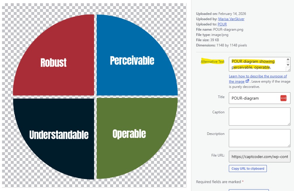
You simply need to describe the context and purpose of your image in that box. Keep it under 125 characters and avoid using it to stuff SEO keywords.
In the example above, the image is my POUR principle chart. The ALT text (to give context) is “POUR diagram showing perceivable, operable, understandable, and robust in a pie chart.”
Alternative text also helps Google understand the context of your images, so it can help with your SEO as well.
WCAG Criteria
ALT text is required under WCAG 1.1.1 (A).
Poor Color Contrast
You may not realize it, but your brand colors can make text on your website difficult to read. Those colors can appear to blend together for students who are colorblind or have low vision.
While you have brand guidelines to follow, you should test your color combinations to ensure all your content is legible.
Free tools like WebAim’s Contrast Checker let you drop in the hexcodes for the text and background colors, then give you a grade. Your colors should get a contrast ratio of 4.5:1 or above to pass.
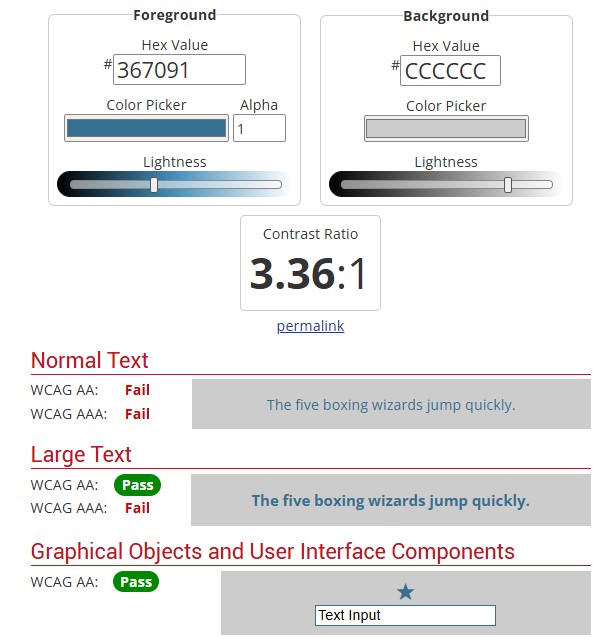
If your contrast ratios are too low, the color combination is too difficult for everyone to read. You may find that combinations you thought were fine are actually causing problems for your students.
I recommend creating a guide you can keep on hand with successful color combinations to save you time.
WCAG Criteria
Color contrast is required under WCAG 1.4.3 (AA).
Skipped Heading Levels
This is perhaps one of the most common issues I see on one client’s website. They allow many different people to edit certain sections of the site (an interesting approach…), and those editors are using headings as design features.
That’s not what heading levels are for at all.
Much like in a Word document, every website has different heading levels available – from H1 down to H6. Heading 1 (H1) is the most important piece of content on the page. It signals to Google and users what the entire page is about. The H1 should be the biggest piece of text on the page, too. You only get one H1 per page.
A heading 2 (H2) should introduce a new topic or section on the page. This should be slightly smaller than the H1 but larger than other headings. A heading 3 (H3) introduces a subtopic and is smaller than the H2. Your subheadings can go down to an H6 (though it’s rare to get beyond an H4). Then, when the topic changes again, you move to a new H2.
This structure helps your readers understand at a glance what is important on the page and allows them to skim your content more easily. It’s also a best practice for SEO, so Google can understand your page.
When heading levels are not used correctly, or you see multiple H1s, skipped heading levels from H2 to an H4, etc., you are causing issues for your readers. This concept applies to blogs and every single page of your website.
(Want an example? Skim this blog. It closely follows the correct heading structure in a very visual way. Just a note: we get down to an H4 in this article.)
WCAG Criteria
Proper heading usage is required under 1.3.1 (A), 2.4.6 (AA), and 2.4.10 (AAA).
Overuse of PDFs
Fun side note: my first job in web accessibility was helping the Scottish government turn PDF documents into accessible HTML. There were multiple people like me on a team that ensured every publication they put out was accessible.
Why is this job necessary? PDFs are notorious for being inaccessible. Depending on how the PDF is created, it could look like a single flat image, or screen readers may navigate it in a wholly out-of-order way.
As a college professor, I know that a lot of important college information gets stuck in a PDF, and people think it’s easy! They can just download that! But have you ever tried to read a PDF on your phone? They’re just a bad experience for everyone. Not to mention the students who use assistive technology and are trying to navigate bad PDFs.
You can make a PDF accessible, but it takes time to go through the document, tag it, add ALT text, adjust the reading order, and ensure the design follows color contrast standards.
How can you fix it? If you can make information available on a simple webpage instead, do that. I know it’s fun to play around in Canva and make things look nice, but a pretty design that’s hard to use does not do much for you.
A great thing you can do? If you want to put your course catalogs or Viewbook in a beautiful PDF, take the time to create an accessible website version of that. It can still look as great, you can still send a PDF, but you can provide an alternative for that information, too. (Just like the Scottish government website still does, 13 years later.)
WCAG Criteria
Technically, all WCAG criteria apply to PDFs.
Advanced Accessibility Barriers
Not every web accessibility issue can be fixed during content creation, unfortunately. How it’s built affects ADA compliance for your college website.
While you may not be able to fix these issues yourself, they are common problems I see on higher education websites. Got a web developer? You may want to send these to them to double-check.
Lack of Skip to Content Links
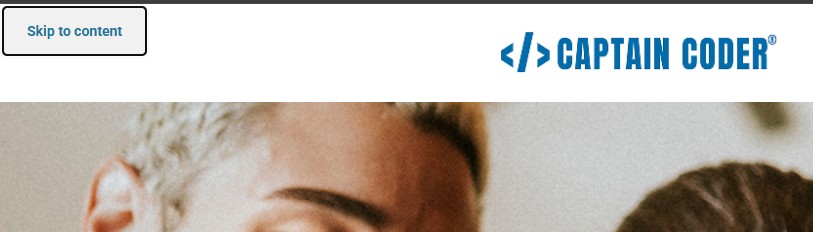
Have you ever attempted to navigate a website using just a keyboard? Not everyone has the option, and many websites are not keyboard-friendly. One particular issue? A lack of a Skip-to-Content link. This link allows people to bypass the main navigation (which, on a college website, can be huge and multi-tiered) and get straight to the page’s content.
This link should be invisible until the tab key is hit. Then, a visible Skip to Content button should appear that users can press Enter to bypass the navigation and move to links throughout the page.
WCAG Criteria
Skip links are required under 2.4.1 (A).
Confusing Navigation and Website Structure
One of our largest projects with NUHS was to fix their confusing website structure and navigation. Before we went through the reorganization, any new Admissions counselors had to be trained on the website so they could direct students to the right content. I don’t know about you, but who has time for that?
When students can’t find what they need in a matter of seconds, you are going to lose them to a rival college. Instead, you need to organize the website by how a prospective student actually searches for information about their major, financial aid, tuition, and visits.
Plus, when your menu isn’t consistent across every page of the website, you make it difficult for students to find their way around. I know a university that has submenus that change BY PAGE, and it is one of the most infuriating experiences. Multiple students have told me they have to Google to find the information they need because it is otherwise impossible to find.
Have a bigger menu? Dropdowns should open on click rather than on hover, too. This prevents people from losing what they are trying to find and improves keyboard accessibility.
Keep everything consistent, and look at other colleges to see how they organize content and navigation menus.
WCAG Criteria
Consistent navigation is required under 3.2.3 (AA), and clear site architecture is required by 1.3.1 (A).
Lack of Semantic HTML
Your web pages also need to use semantic HTML structure (this is definitely a developer conversation) to ensure that assistive tools, AI, and Google can understand all your content.
There are several HTML tags, such as <nav>, <header>, <footer>, <section>, and <button>, that clearly indicate their content type. Without these tags, assistive tools will not be able to fully understand your content. Your developer may like using something called an aria label, but these are shortcuts that you rarely need if your website is coded correctly. Most web accessibility experts will tell you that the fewer aria labels you use, the better.
Using semantic markup actually improves keyboard navigation, site architecture, heading-level usage, and much more. It solves many web accessibility problems at the root.
WCAG Criteria
Semantic HTML is required by 1.3.1 (A).
The Business Case for Web Accessibility
ADA compliance for college websites is a multi-step process. While you can fix some things on your own, you might need skilled web accessibility experts to help you achieve full compliance. No matter what you are doing to improve your website, you will probably need some buy-in from leadership.
Not sure how to convince them? At the end of the day, web accessibility has an incredible ROI. Research shows that on average, web accessibility improvements net a 100:1 ROI. Yes, you read that correctly. 100 to 1. That’s higher than anything you can be doing in your marketing.
Why is that ROI so high? Because web accessibility positively impacts multiple aspects of your website.
- Maximizes Enrollment Pipelines: Barriers are removed throughout your funnels and website.
- Increases SEO and Visibility: Search engines and AI tools read your website similarly to screen readers. Semantic HTML, ALT text, and proper headings directly boost organic rankings.
- Mitigates Your Legal Risk: More web accessibility lawsuits are being filed every year, and Title II Subpart H will go into full effect in April 2027.
Plus, web accessibility is just the ethical, right thing to do to improve all of your students’ lives.
Getting Started with Web Accessibility
For as technical as web accessibility is, there are a lot of things you can do to immediately improve your website.
Take the four main quick wins we covered and turn them into a process for all your content creators to follow. Start with our free Image Optimization Cheat Sheet and fix the biggest offender for most colleges.
Then, talk to your web developer or whoever manages your website and see if you have any advanced accessibility issues. They will take more time to fix, but make a huge impact on your user experience.
Want to know how bad your website actually is? Book a web accessibility audit. We can help you identify the specific issues affecting your ADA compliance and provide a roadmap to fix them.