Digital accessibility has never been optional. Every time you publish a blog, social media post, video, or update your website, you risk excluding some of your ideal customers. While hearing about web accessibility or ADA-compliant websites may feel new to you, it’s always been a necessity. People just started to care because lawsuits increased.
Good.
I’ve been working in web accessibility for over 13 years, and too many marketing teams kept ADA compliance on the back burner for far too long. No one wants to get sued, but suits helped people care about something that’s been misunderstood for a long time.
I want you to understand something important: any accessibility improvements you make are great. You do not need to be perfect to make a massive difference in someone’s day, life, or their ability to work with you.
If you and your team are researching and trying to figure out where to begin, keep reading. In this article, we demystify ADA compliance, explain how overlays are band-aids that can make things worse, and show you how to create accessible online experiences.
Table of Contents
What ADA Compliance Really Means
One quick disclaimer: ADA-compliant websites are a bit of a misnomer. When we talk about meeting ADA standards, we mean creating websites that follow the Web Content Accessibility Guidelines (WCAG).
In the US, the Americans with Disabilities Act (ADA) requires that businesses and organizations provide people with disabilities reasonable accommodations. You may be most familiar with ramps or elevators in addition to stairs, talking crosswalk signals, and larger bathroom stalls with handles.
A common misconception? The ADA does not specify how organizations must adjust for digital spaces. This meant that for years, as the web grew and more and more businesses turned paper- or phone-based processes into online ones, they did not fully understand how they were excluding people with disabilities.
This is where we saw a rise in lawsuits. While the UK’s Equality Act passed in 2010, the US was woefully unclear. Web accessibility lawsuits helped create precedent, and judges throughout the country made it clear that the ADA’s requirement for “public accommodations” applied to digital spaces, too.
In April 2027, Title II Subpart H will go into effect. It defines what constitutes digital accessibility compliance for government-funded organizations. As with many laws, those requirements will eventually trickle down and govern private enterprises under Title III. However, Title III currently requires organizations to provide “reasonable accommodations” in their own digital spaces.
This is a lot of semi-legalese. What does it mean? People with disabilities need to be able to use and understand your digital content. Whether that’s your website, social media, or extra resources, it needs to work for everyone. If it doesn’t, you need to provide an alternative.
How do you know your content works for everyone? Judges have determined that we should follow international standards.
WCAG Level 2.1 AA
That’s correct. Currently, the ADA does not establish how to comply. But due to legal precedent, we know that as long as we meet international web accessibility standards, we should be compliant.
Most laws worldwide consider WCAG 2.1 AA the universal benchmark. Your content needs to meet these standards every time you publish.
While the list of guidelines may not look like a lot, web accessibility is incredibly nuanced. Remember: any improvement helps, but have real people test your content whenever you can.
Business Benefits
While web accessibility improvements aid real customers and make it easier for them to work with you, they also have tangible business benefits.
Roughly 28.7% of US adults have some form of disability. That’s a huge subset of your audience who could surf the internet differently from you. It’s also almost a third of them you can be actively excluding.
Technical SEO best practices follow WCAG standards. Google crawls the internet much like a blind person uses a screen reader. Meeting WCAG means improved search discoverability across search and AI engines.
UX design principles also align with WCAG best practices. Accessibility fixes make websites cleaner and faster for every user, increasing conversions and leads.
Web accessibility guidelines are really just website best practices.
Accessible Foundations
For years, when I talked about web accessibility, it felt like screaming into a void. As lawsuits spurred action, overlay widgets like accessiBe gained popularity. Here was something simple, easy, and quick we could add to our website to make it compliant. This was a magic cure for accessibility and how hard it felt, right?
Yea, wrong.
Many of these quick-fix tools fail to actually address most accessibility issues. They may give you options so you don’t have to overhaul your website and branding, but they miss a lot of the core problems.
Web accessibility starts with the right foundations. Everything from how you write to the color combinations you use across your marketing to how your website is coded affects whether or not your content is accessible. You can improve it without burning it all to the ground, but true accessibility starts during the planning phases.
Native HTML vs ARIA Labels
I’ll be honest: proper HTML syntax feels a bit like a lost art. Many amazing web developers who build WordPress themes and content management systems learned backend languages but never HTML. I’ve met many of them in my career, and they all thought HTML was a joke. That’s why much of the HTML these systems write is absolute junk.
I know this may not mean much to you, but any website full of divs and bandaged with ARIA labels is written incorrectly. Can they objectively work for someone using assistive tools? I guess. But they don’t help your SEO or the visual hierarchy proper HTML provides.
Your website needs to use semantic HTML. These tags provide accessibility out of the box and communicate your structure to assistive tools, but search engines as well. Use tags like <header>, <main>, <section>, <footer>, and <nav> to structure your content. Follow proper heading hierarchy so the visual styling matches the actual content’s importance. Use the correct tags for the type of content, like <button> instead of <div>, and you won’t need to write as much CSS to get things to behave the way you want.
Before you freak out, many website builders allow you to select the HTML tag you want to use, even in drag-and-drop interfaces. Just note: you may need to work through your website with an expert, because swapping tags could cause visual changes.
Why Overlay Tools Fail
As I mentioned, overlay tools often miss many accessibility errors. They can tell you if you forgot an ALT tag or allow your customers to switch your website to “high contrast,” but they won’t fix bad HTML.
Overlay widgets are a lot like automated scanners; they can find about 30% of the actual problems. Human testing is required to find most accessibility errors, because it’s humans that will be using your websites.
Too many organizations treat overlay widgets as a fix-all and then forget basic accessibility steps, too. And of course, they do nothing to improve your social media or external digital content.
Creating Accessible Digital Content
What are some of those basic accessibility steps? You can create ADA-compliant websites by making simple improvements, one thing at a time.
Let’s dive into a few that should be part of your daily content creation process.
Adding Text Alternatives for Media
Every time you upload an image, write an alternative text description, or ALT text. Describe the image’s context and purpose on the page. Why are you adding this roadblock to someone listening to the website being read to them? Tell them.
Images that are purely decorative (e.g., a swirl or sunburst) can have a blank ALT tag. The ALT should still be in the image tag, just nothing would appear between the quotes. For example, it would be alt=””.
Adding videos or audio with narration? Those need to have closed captions or transcripts available.
Do your videos contain visuals that aid your story? Describe those visuals in the audio or upload a separate audio description to your video host.
Use Descriptive Link Text
Have a bunch of links throughout your website that say “click here?” It’s time to scrub all of those. Links on your website should explain where someone will go when they click. Phrases like “click here,” “learn more,” and “read more” don’t explain where the link will take someone.
Instead, that link text should say exactly what happens. For example, “Download Marketing Strategy” or “Register for This Event.”
Make Forms Clear
At one point, form labels were out of style with designers. They wanted forms to be “clean,” with labels inside the form field itself. Why was this problematic? Because labels make forms easy for everyone to understand and use.
Instead, you should have clear labels like “Name,” “Email,” and “Phone” in an actual
You should also include straightforward error messages. These should not rely on color and should state exactly what is missing from the form. Think of “You need to provide an email” instead of just highlighting the email address field with a red border.
Technical Accessibility Issues
If your website is built on the right HTML foundation and you follow basic best practices, many of these deeper technical issues resolve themselves. However, you need to test these manually to ensure you meet ADA standards.
Keyboard Navigation & Focus States
Some customers need to use their keyboards to navigate your website instead of a mouse. Not only must you be able to tab through the site to every interactive element (buttons, forms, and links), but you need to be able to see where you are on the page.
This is called the focus state. When a user tabs to an interactive element, it should be highlighted in some way. This can be a colored border, but it must be more than just a color change.
A common problem is what we call keyboard traps. These are spots like pop-ups or sliders where you cannot move on or close the element without using a mouse.
The great news? This is often solved when a website uses semantic HTML.
Hide your mouse and try to do the 3 most important things on your website. Does it work? Is the experience clear?
Using Colors Correctly
If you’ve been reading about ADA-compliant websites for longer than a few minutes, you may understand the importance of color contrast. Text and background colors must meet a 4.5:1 ratio. If they don’t, color-blind customers may not be able to see the text at all.

While contrast is a bit more nuanced than simple contrast checks suggest, it’s where we start to ensure our website is legible.
We also cannot use color to denote crucial information. Too often, designers change only the color of a link to show it has focus, but a color-blind user may not see the change. Instead, we want to use another change, like icons, messages, or underlines, so everyone can see the shift.
Logical Reading Order
Everyone wants to skim your website. They also don’t want to work too hard to understand it. (And yes, I know that you’re skimming this article right now and no, I’m not offended.) To make your content skimmable, use correct heading structure.
Each webpage should have an <h1> that is the main point/heading of the entire page. Then introduce each new topic with an <h2>. Start any subtopics with an <h3>. When the topic changes again, use another <h2> to begin, and so on. The H1 should be the largest text on the main page, then the H2s, then the H3s, and on down through a possible H6. This visual and HTML hierarchy helps visual readers, screen reader users, and Google understand the context of your content.
While this entire article (and my website) is a good example of accessible headlines, I also have an infographic that lays it out:
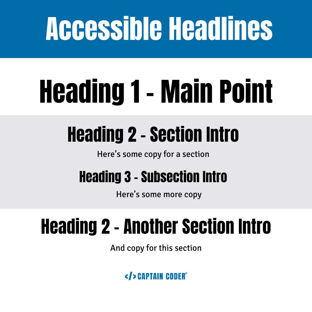
Using headings correctly helps people move through your website more easily, find what’s important to them quickly, and move them toward an actual lead or conversion.
How to Get Started with Web Accessibility
Before you spiral, you need to understand how far off you are from having an ADA-compliant website. The first step is to run an initial web accessibility audit. You need to do manual testing alongside automated tools because they catch only about 30% of web accessibility issues.
Once you know what issues you need to address, create an action plan. Fix high-traffic and conversion-heavy pages first. This keeps customers moving through your funnels and prevents you from losing people.
Then, create a process to keep your website accessible. An ADA-compliant website is not a one-and-done project. Your website can fall out of compliance with just a few incorrectly posted blogs and images. Your team should follow the same process so there’s no confusion.
Want to make all of this much easier? Partner with a web accessibility expert. At Captain Coder, we can run your web accessibility audit with manual testing and give you the roadmap you need to fix your website.
Then, we can train your team with our Creating Accessible Content course. It walks them through the entire process of creating regular, accessible content while helping them understand why we do certain things.
It’s time to not only make your website ADA-compliant, but also build an inclusive web experience for all of your customers.